VUI — Asian Online Grocery Store
Brand identity and application across packaging and communication for an online Asian grocery brand.
Overview //
Type
Brand Identity
Packaging
Communication Assets
Tools
Adobe CC
Scope
Digital, Print, Physical Assets
Period
2021
Context
VUI is an online Asian grocery store created for a growing audience interested in contemporary Asian food culture and everyday cooking. The brand required a recognisable identity that builds trust, feel culturally grounded without relying on clichés, and works across both digital and physical media. The name VUI, meaning “happy” or “joyful”, establishes an emotional foundation that informs the tone and character of the brand.
Goal
Develop a brand identity that translates across packaging and communication, creating a presence that feels contemporary, approachable and culturally informed.
Work //
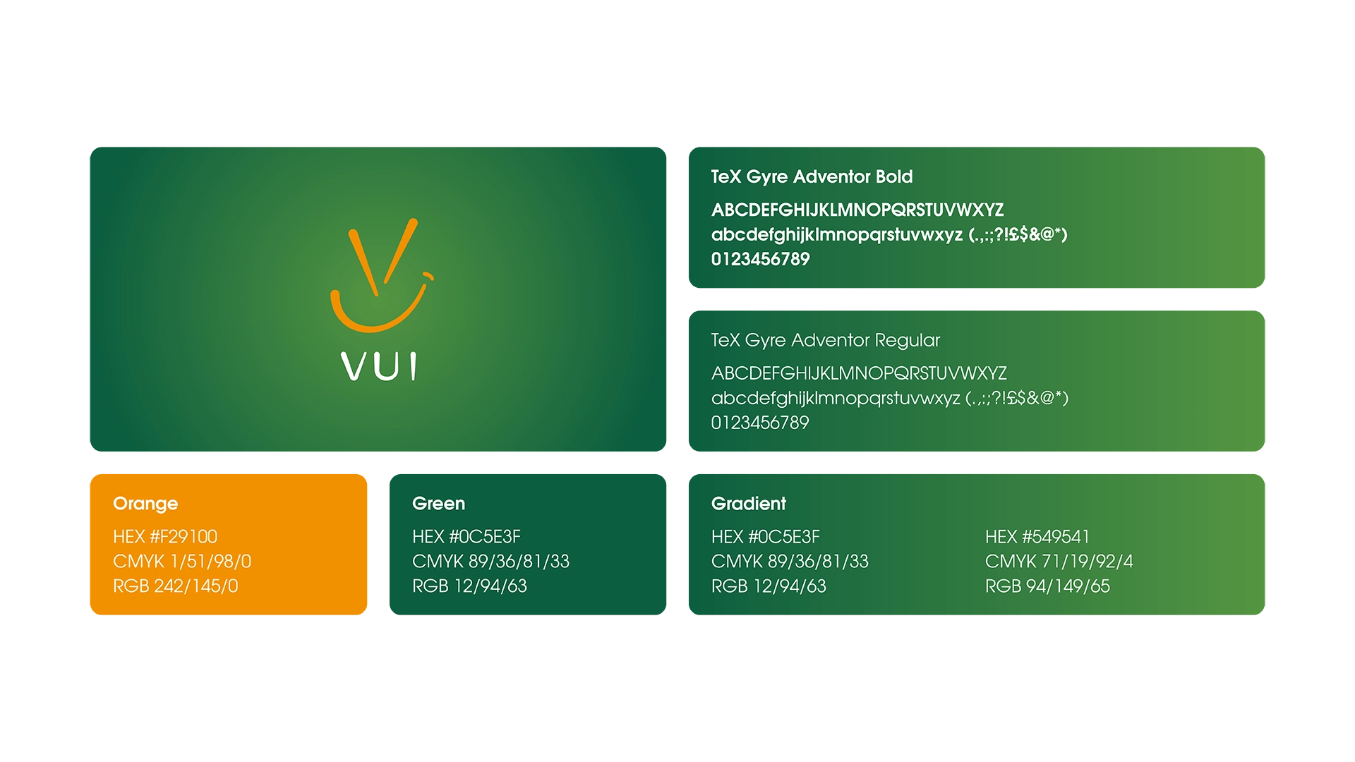
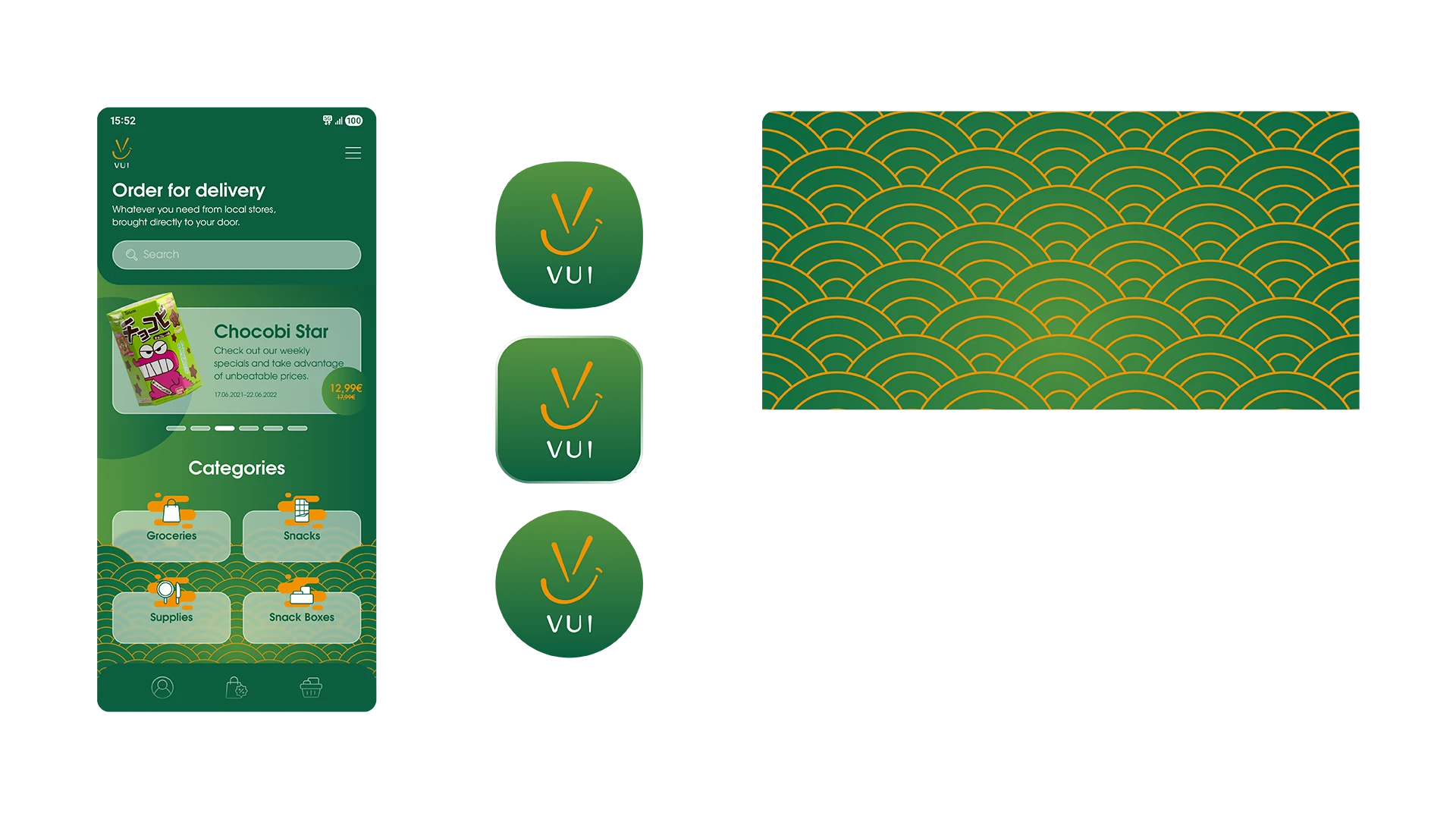
01 Brand Identity
Image
Challenge
Creating an identity for a new Asian grocery brand that references cultural context without falling into stereotypical or overly decorative design tropes. The identity needed to resonate with a younger, design-aware audience increasingly engaged with Asian cuisine, while remaining accessible and recognisable across a wide range of applications.
Approach
The logo translates the letterforms into a compact symbol combining multiple references: the characters themselves, a bowl with chopsticks and a subtle smiling expression. This creates a mark that reflects product context and tone simultaneously. The color system builds on the green rooted in the family-run business behind the brand, preserving continuity. Complemented by a warm, high-contrast accent color, a more dynamic color palette emerges, well-suited for a food-focused brand. Supporting wave and cloud patterns were developed as a repeatable visual layer, introducing cultural reference in a restrained and scalable way.
Image
Outputs
Final logo (symbol and wordmark)
Defined color palette and typography system
Core visual identity assets
Repeatable pattern system for cross-channel application
Result
The identity establishes a clear and structured system that translates flexibly across different media. By combining distinctive symbolism with a restrained design language, the brand message is conveyed in a focused and intentional way without resorting to insubstantial elements.
Image
Image
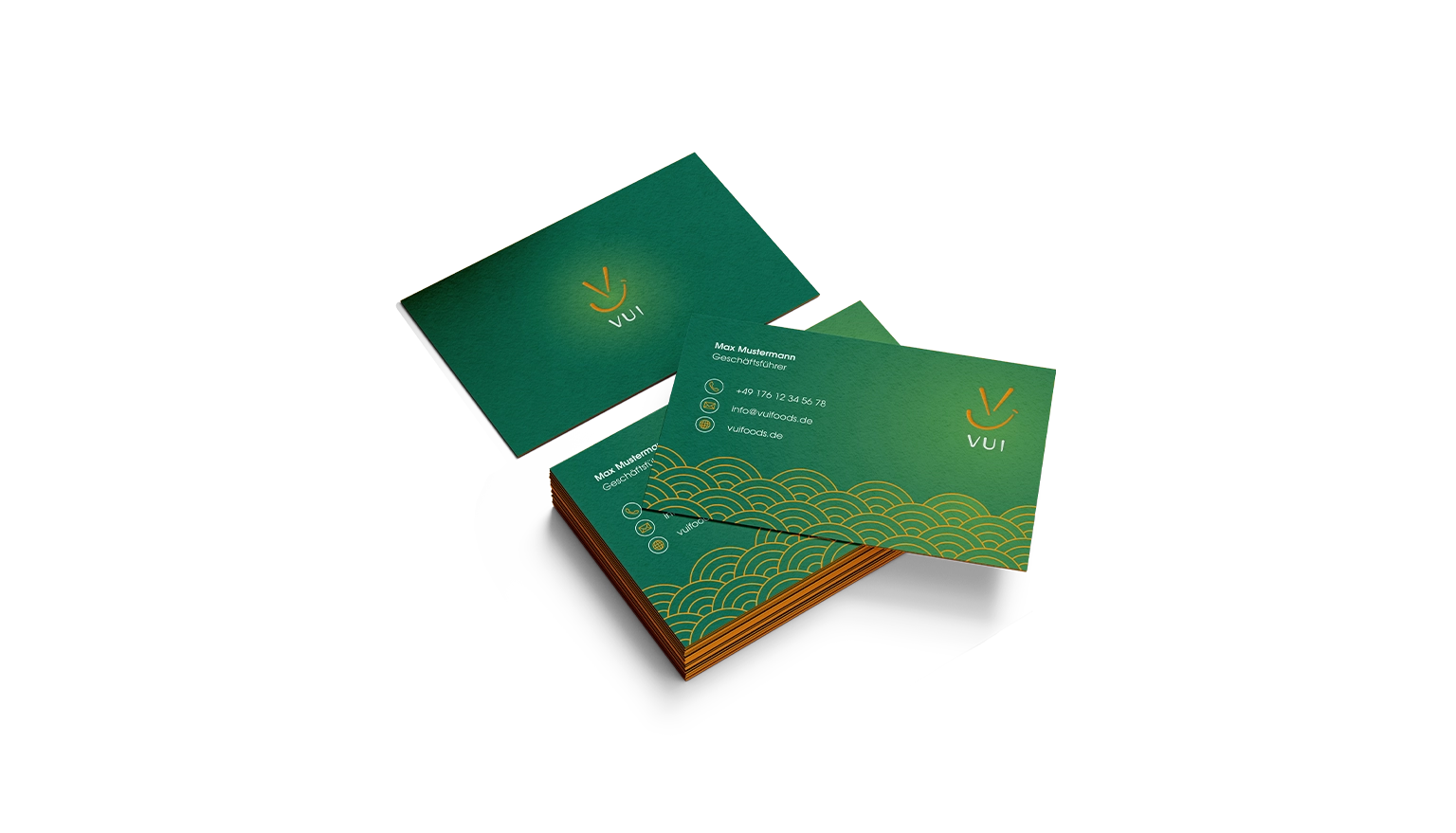
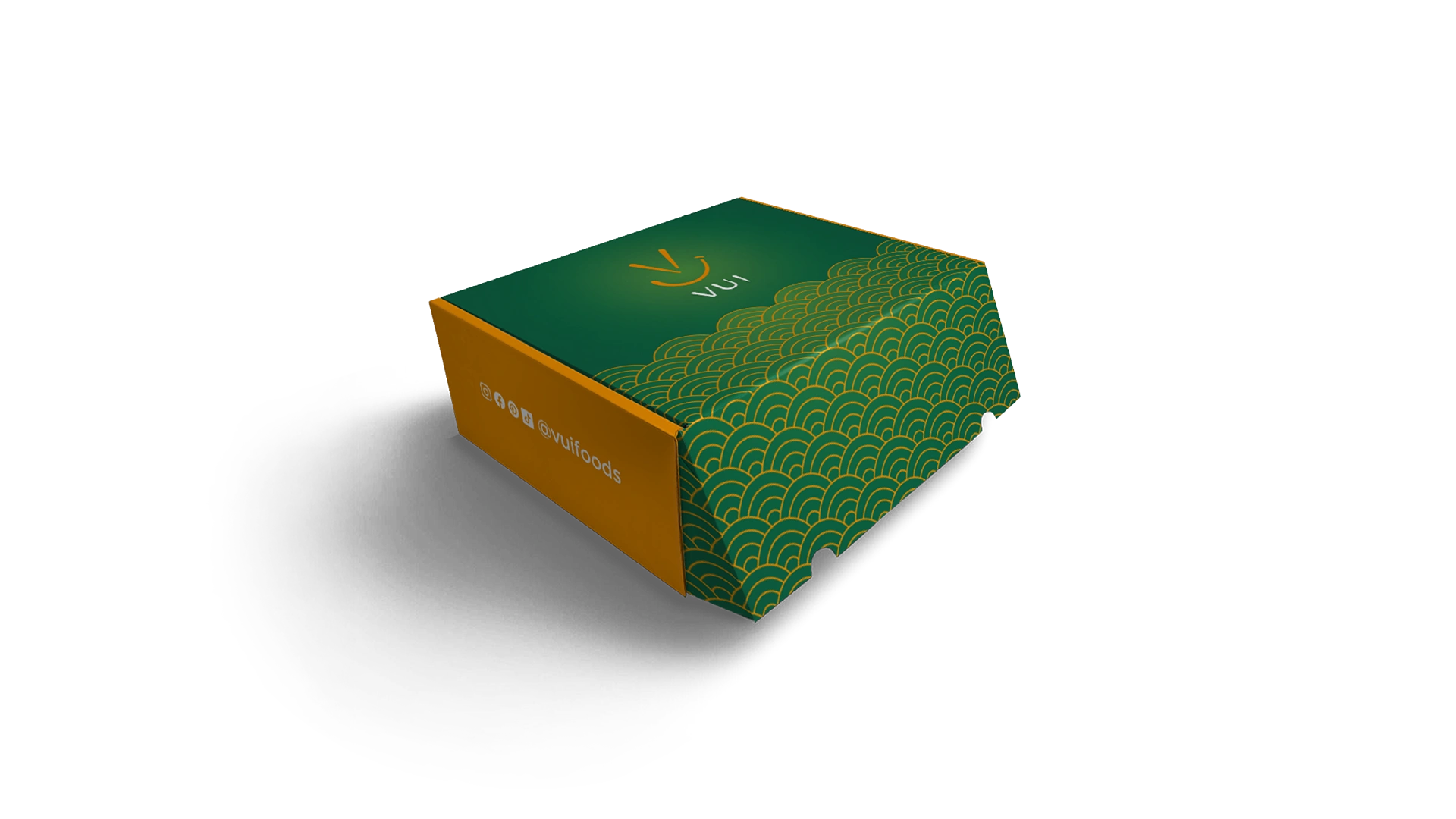
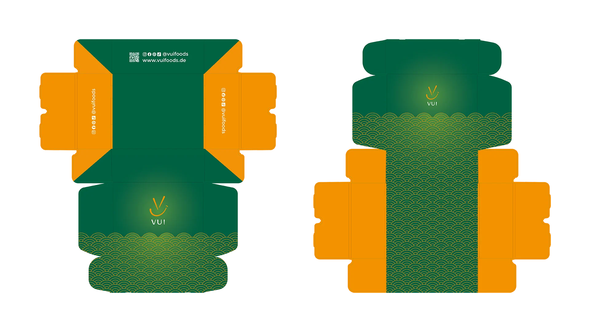
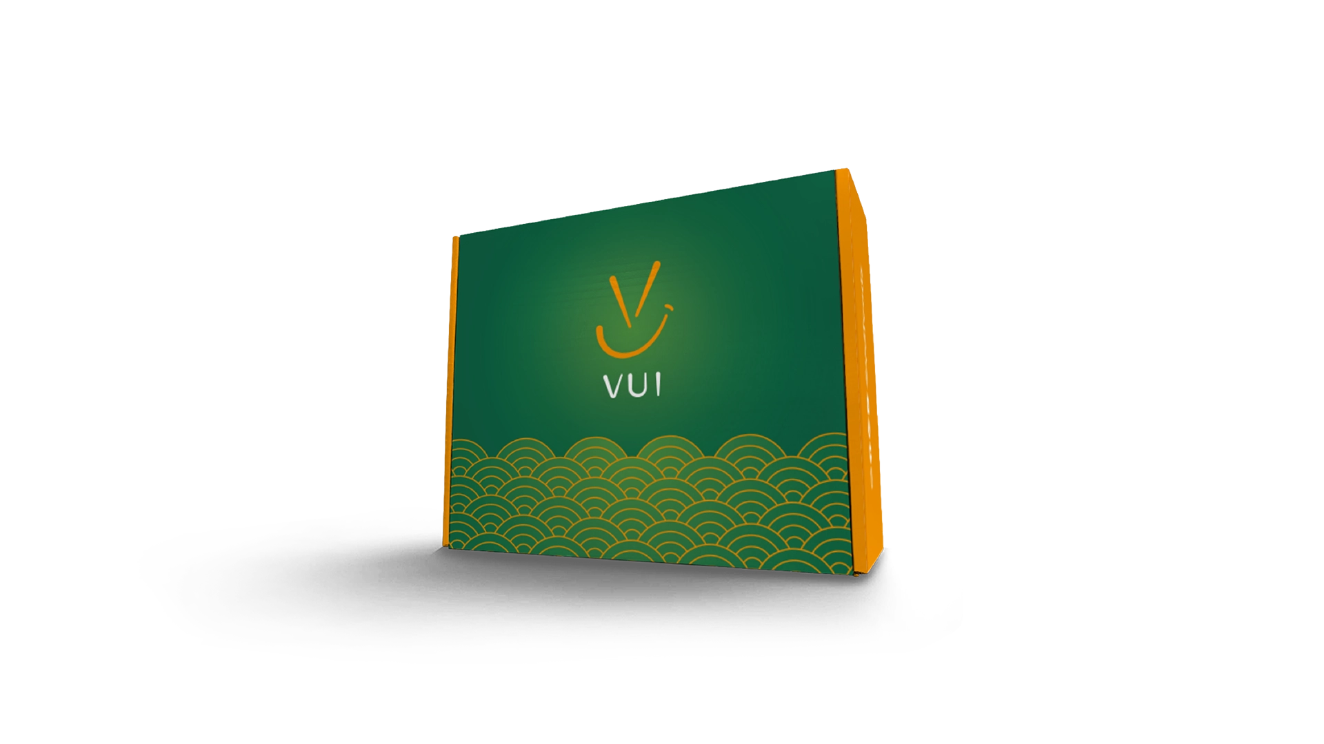
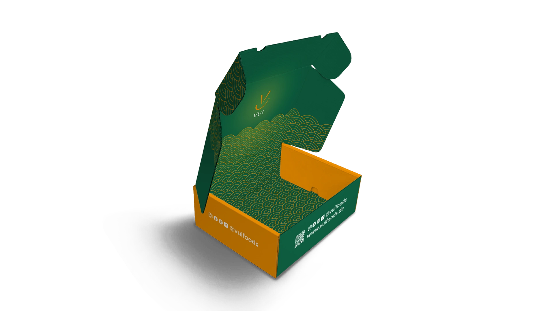
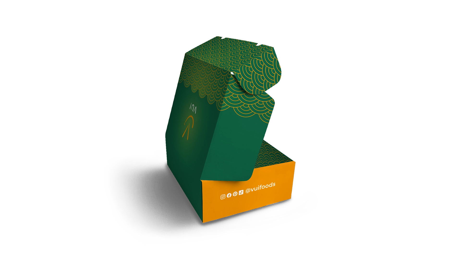
02 Packaging
Image
Challenge
Translating the brand identity into a physical format that also works effectively in logistical settings while meeting requirements for readability and production.
Approach
As the first physical touchpoint in the customer journey, the shipping box was designed to carry the brand beyond digital space and turn delivery into a memorable brand experience. Using the wave pattern as a dominant surface element creates a strong visual presence even within a typically neutral shipping context. At the same time, the design remains print-efficient and easy to reproduce.
Image
Outputs
Final shipping box design
Print-ready packaging artwork
Branded packaging integrated into the customer delivery experience
Result
The packaging translates the brand into a prominent physical format through large-scale patterns and bold contrast, ensuring strong visibility in logistical environments and during the shipping process. This extends the brand beyond digital contexts into everyday physical environments.
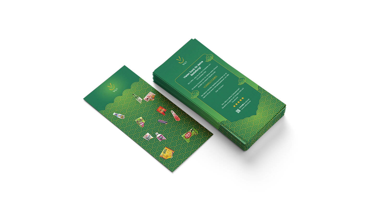
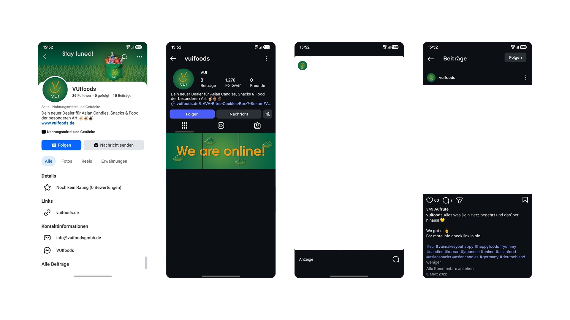
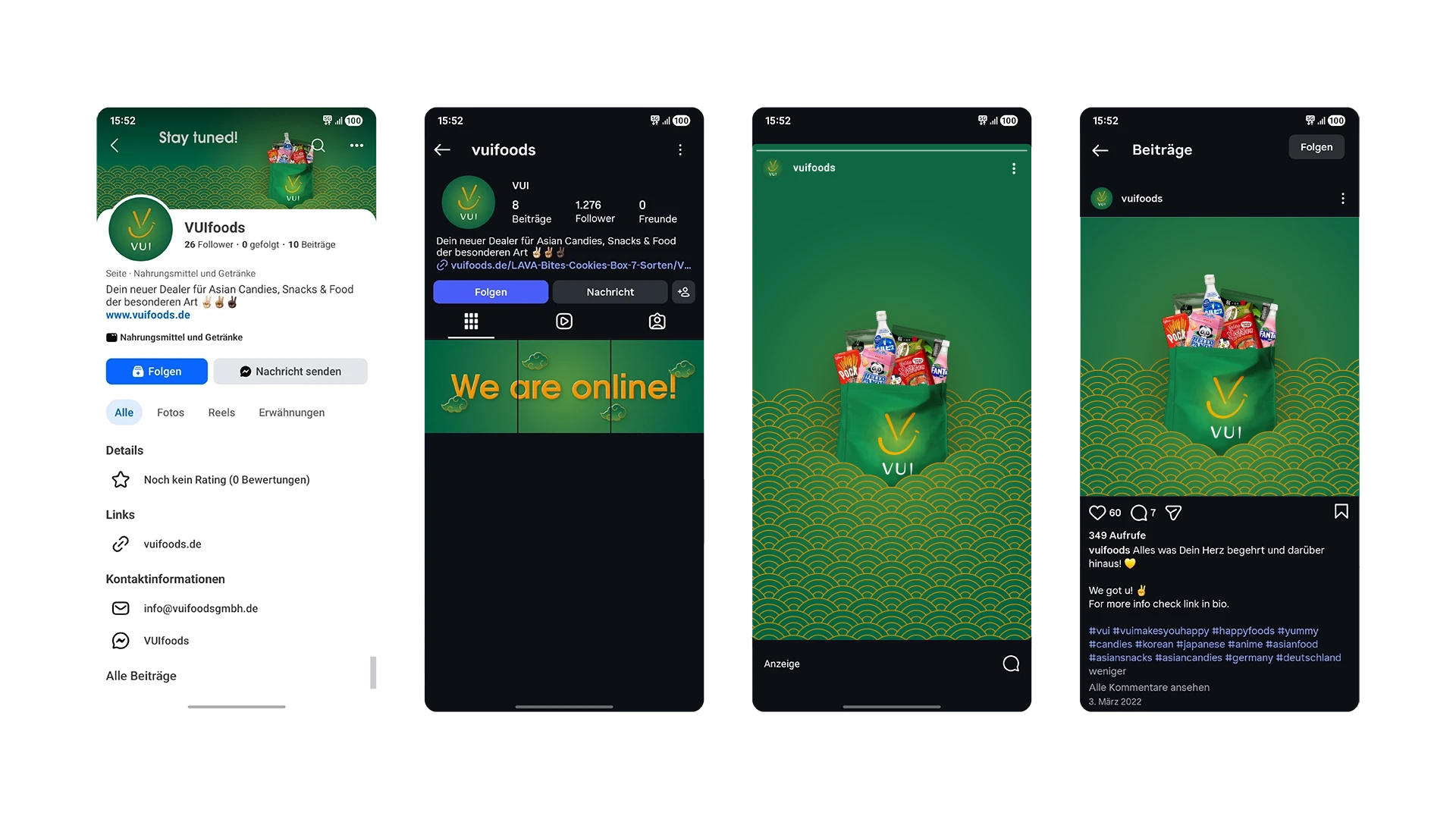
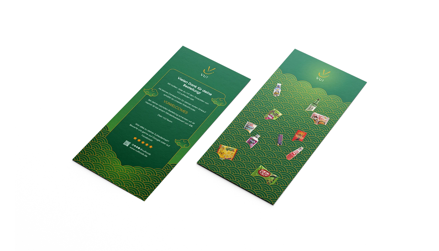
03 Communication Assets
Image
Challenge
Establishing a distinct and appealing brand presence for a newly launched business across communication formats. With no existing awareness, communication assets needed to define how the brand is perceived from the first interaction and, through a consistent design language, spark curiosity while also building trust.
Approach
The brand identity was extended into communication channels through defined layout principles and a controlled use of design elements. To organise content, the pattern system was further developed and expanded with additional context-specific elements. This balance between expression and readability ensures that both promotional and service-oriented content remain clearly associated with the brand, whether on flyers or on social media.
Video
Outputs
Social media visuals
Flyers and promotional materials
Consistent visual communication across formats
Result
Reduced and well-defined design elements allow information to be quickly grasped, while keeping the brand recognisable. Layout structures and recurring elements prioritise content and guide attention, ensuring that both promotional and informational content remains effective, even in environments where numerous messages compete for attention.
Image
Impact //
Reflection
This project demonstrated that a brand identity reveals its full potential only in real applications. For VUI, packaging and communication proved to be key moments where the brand needed to perform. Working within the food context made it apparent how strongly trust, perception and confidence influence decision-making, requiring the design to communicate meaning immediately. Without prior awareness, the design needed to convey what the brand stands for at a glance, rather than relying on recognition built over time.
Highlights
Development of a unified brand identity across various touchpoints
Translated identity from digital to physical formats
Strengthened approach to scalable brand application across packaging and communication