MyHealthy.plus — Digital Health Platform
Development of a brand and interface system, that translates complex content into a clear and accessible structure.
Overview //
Type
UI/UX Design
Brand Identity
Tools
Adobe XD
Scope
Web, Desktop & Mobile
Period
2021 – 2022
Context
MyHealthy.plus is a digital platform focused on health prevention and healthy aging, built around a book and learning shop concept. The platform combines educational content, practical health guidance and curated product recommendations, targeting users who want to integrate health-focused habits into their daily lives.
Goal
Translate a content-heavy health platform into a structured and accessible digital experience that enables users to easily explore information, understand recommendations and navigate between content and products.
Work //
Brand & Interface Design
Video
Challenge
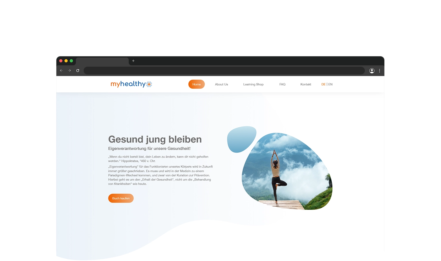
The platform covers a wide range of health topics across educational, practical and commercial content. Bringing these together into a single interface without overwhelming the user required careful thinking about hierarchy, structure and visual language to make complex health information feel accessible rather than clinical. At the same time, the design had to work within the constraints of an existing CMS the client wanted to retain. This demanded a system that was not only visually coherent but also easy to implement and maintain, ensuring content could be updated without unnecessary complexity.
Approach
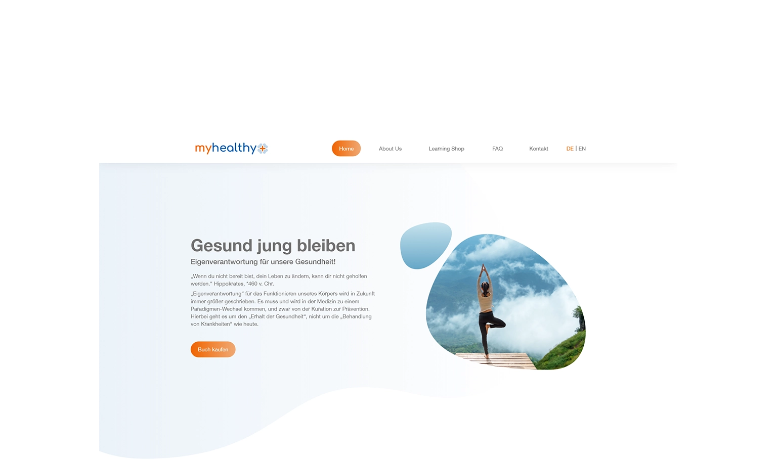
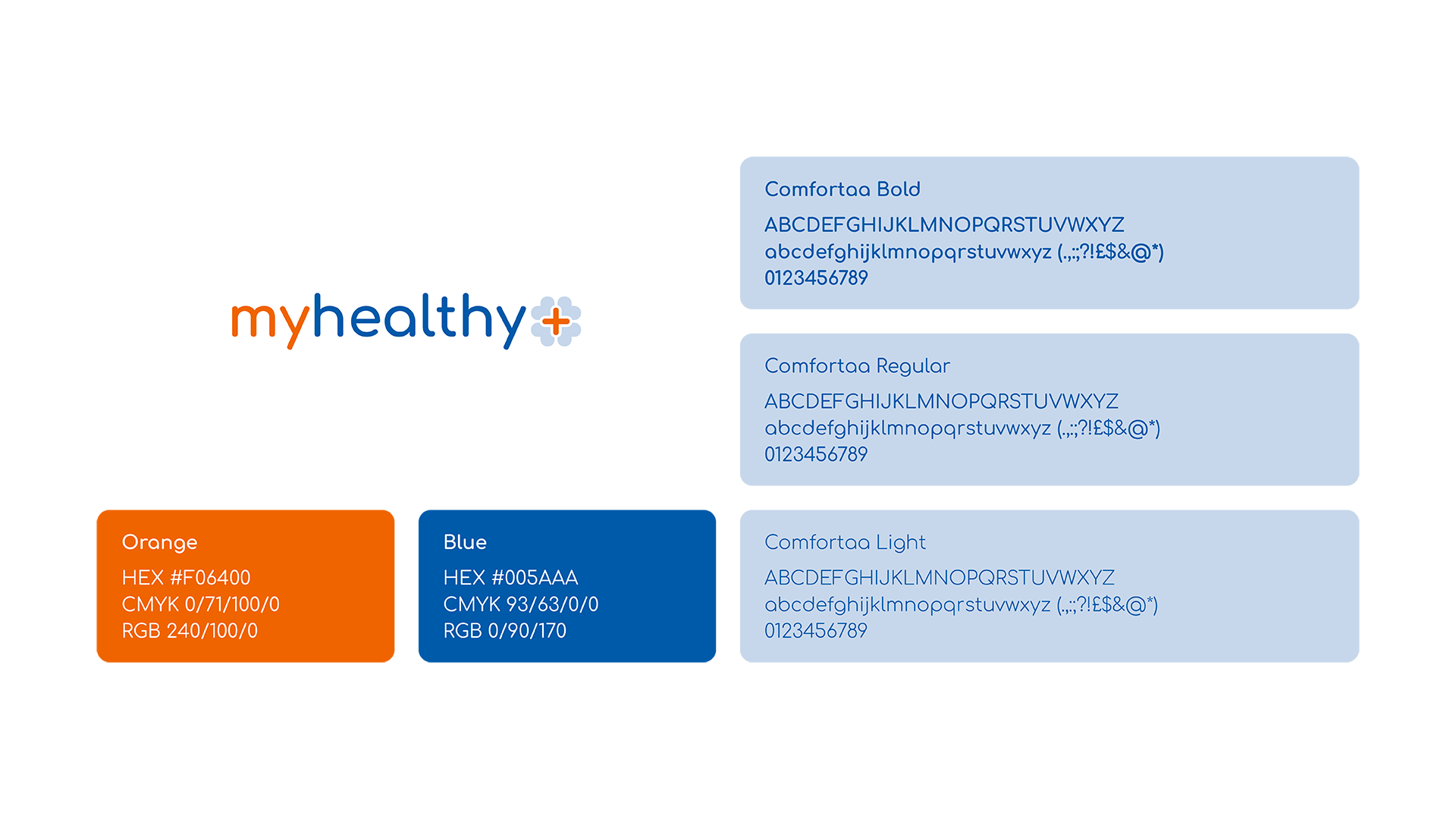
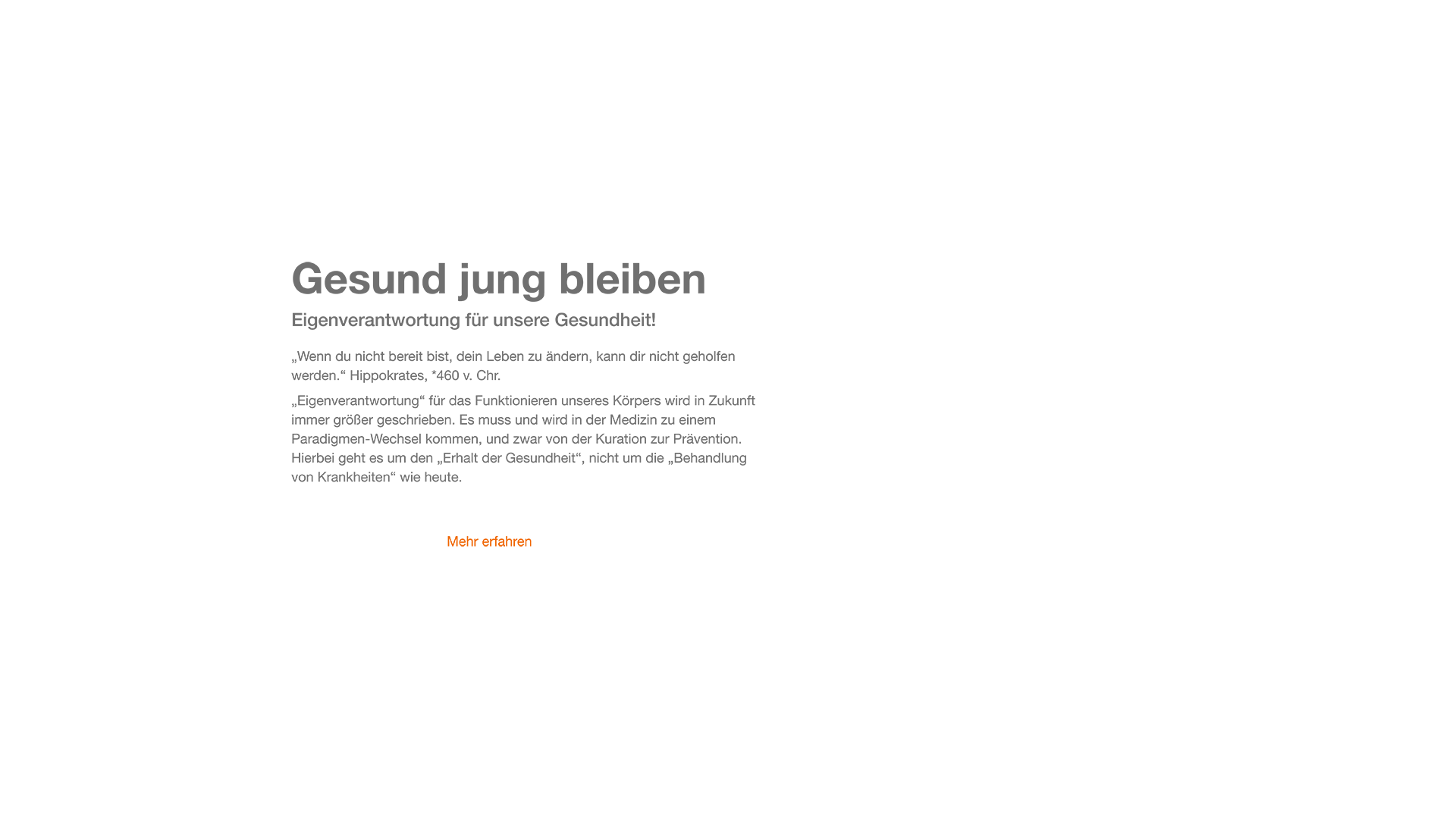
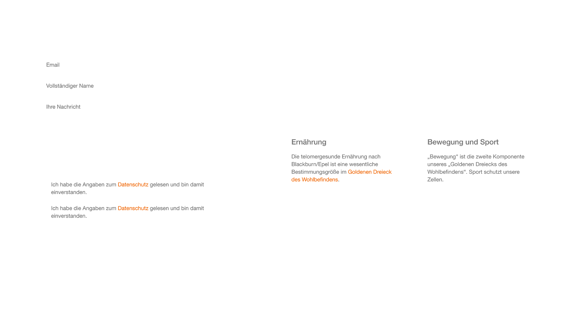
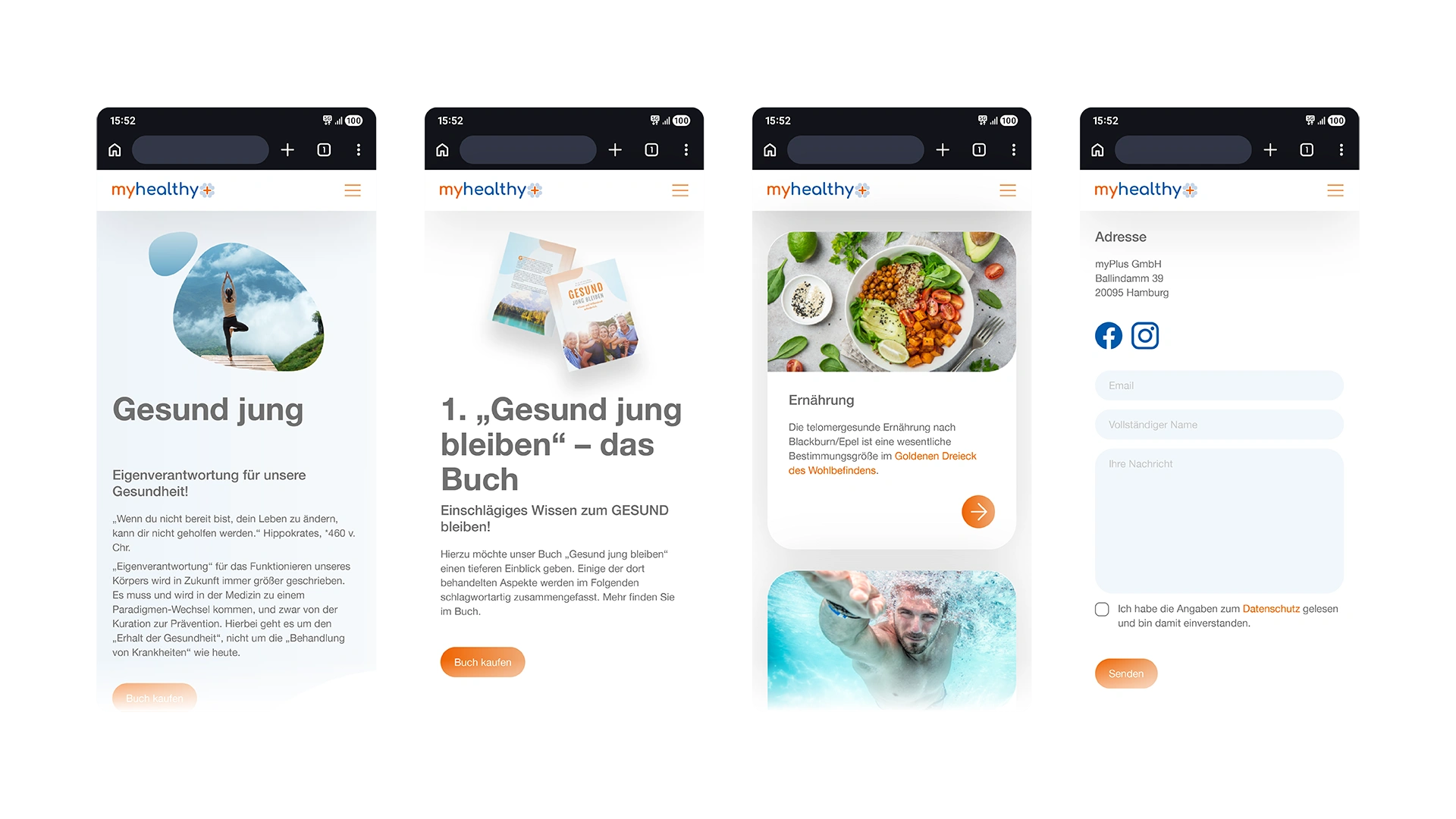
I developed the visual identity and interface system in parallel, ensuring that brand and UI decisions reinforced each other from the start. The identity is built around a soft, organic visual language using rounded shapes, a restrained blue-orange colour palette and a calm typographic hierarchy, reflecting the platform's focus on wellbeing rather than medical authority. The same logic carries through into the interface, where layout structures and content patterns were designed to make information density manageable and navigation intuitive across both desktop and mobile.
Image
Image
Outputs
Visual identity including logo, colour and typography system
High-fidelity interface layouts for key platform sections
Structured layout system supporting content and product integration
Responsive design across desktop and mobile
Result
The new developed system enabled the platform to present complex health content in a way that feels approachable rather than overwhelming, supporting both content consumption and product discovery within a unified experience. Clear structure combined with a calm visual language guided users through different content types without creating friction.


Image
Impact //
Reflection
This project required brand and interface to be developed in parallel rather than in sequence, shaping a more cohesive system from the start. When identity and UI decisions inform each other early, neither feels retrofitted to the other. Designing for a broad, non-technical audience reinforced that hierarchy and readability are not just visual preferences but functional requirements that directly impact usability.
Highlights
Developed a complete visual system from identity to interface within a single project
Designed for a broad, non-technical audience where clarity directly influences usability
Strengthened approach to content hierarchy and structured information in interface design