Ashpazi — Afghan Cookbook
Editorial design and illustration system for a contemporary Afghan cookbook.
Overview //
Type
Visual Identity
Illustration
Editorial Design
Tools
Adobe CC
Scope
Print, Book Design, Visual System
Period
2019
Context
Ashpazi is an Afghan cookbook developed as part of my master’s thesis, exploring Afghan cuisine through a modern lens. The project is rooted in my personal connection to Afghan culture shaped through family and food. Growing up, I never had the opportunity to experience Afghanistan firsthand due to the country’s prolonged political instability. Instead, my understanding developed through everyday rituals at home — recipes, traditions and shared meals that carried meaning beyond geography.
Goal
Create a contemporary cookbook that presents Afghan cuisine beyond clichés, combining authenticity with a modern, design-driven approach to engage a younger, design-aware audience. The project aims to offer a different perspective on Afghan culture, using food as an entry point to experience it beyond common perceptions.
Work //
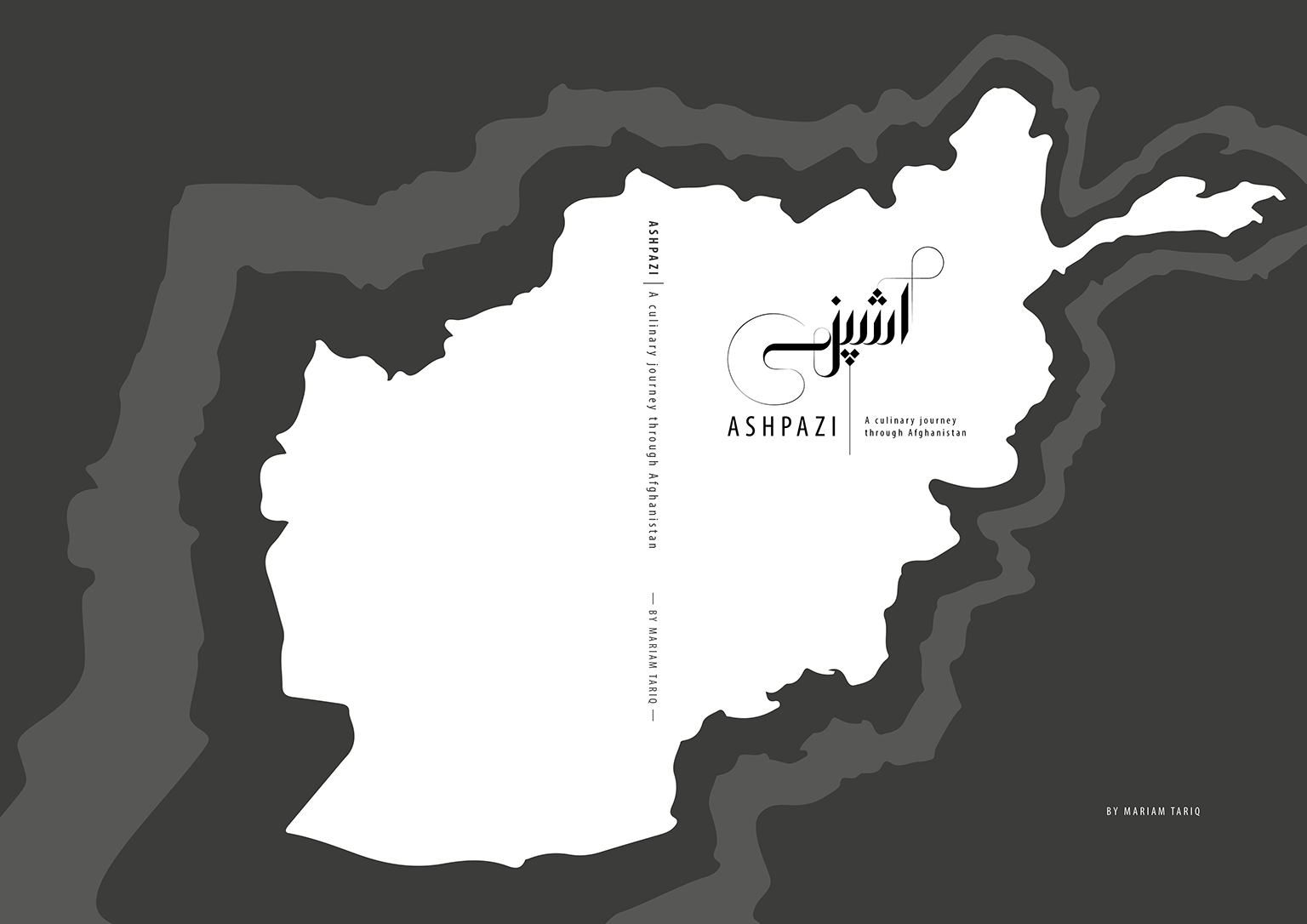
01 Visual Identity
Image
Challenge
Developing a visual identity that reflects Afghan culture without relying on stereotypical tropes or ornamental overload. The identity needed to feel contemporary and approachable while still conveying cultural depth.
Approach
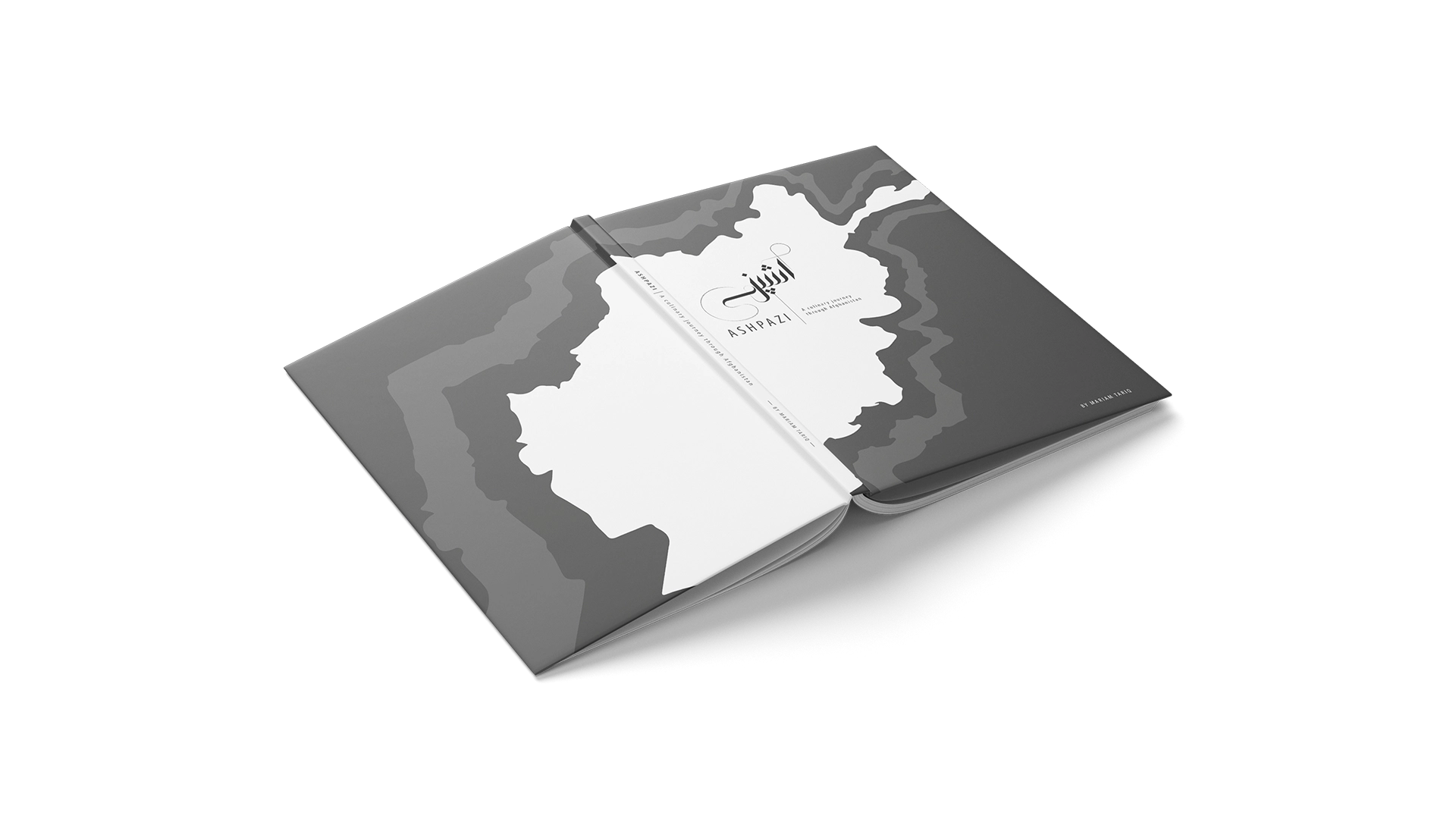
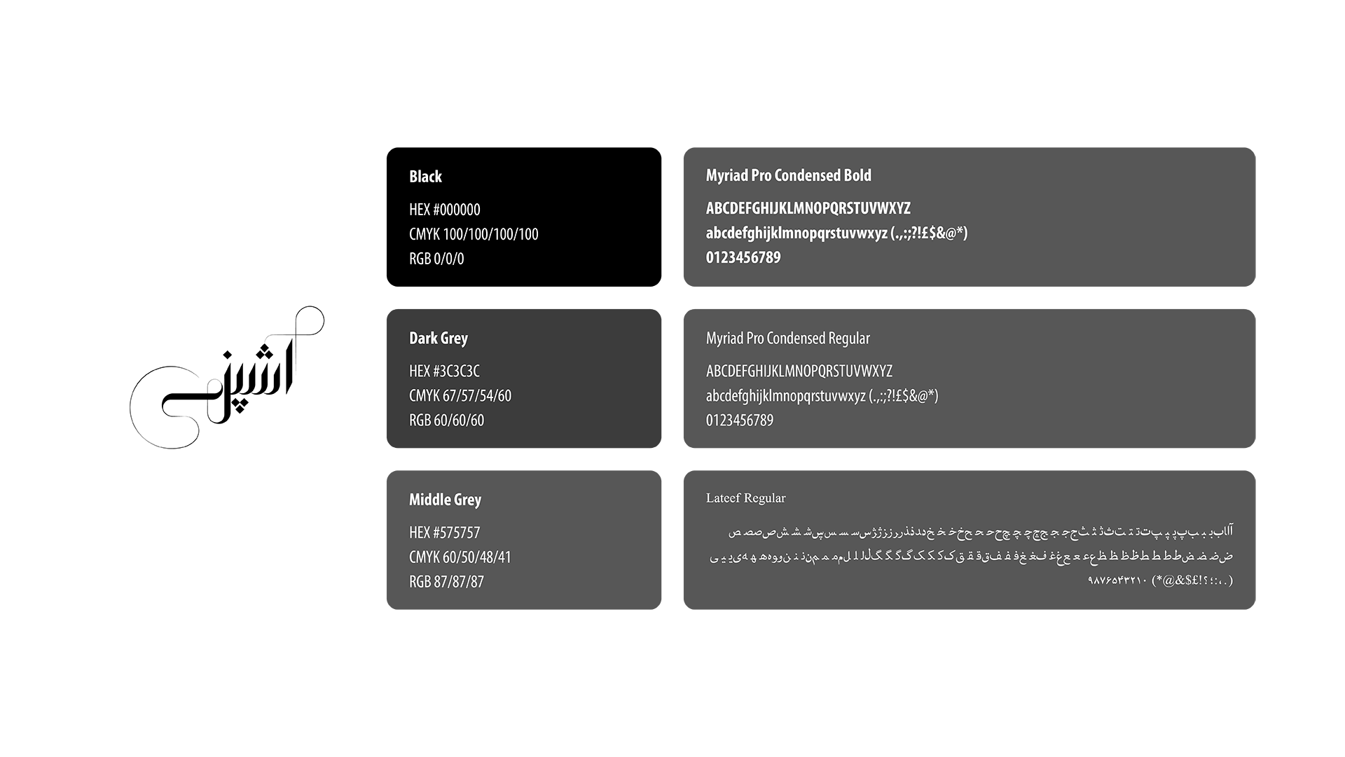
The visual identity follows a modern and reduced design language, combining geometric precision with subtle organic elements. The logo is constructed from linear shapes, softened by controlled curves to create balance between structure and fluidity. Diamond-shaped dots, inspired by typographic characteristics of Arabic scripts, are introduced as a recurring visual element throughout the book. Minimalist outlines of Afghanistan span the cover, layered in a way reminiscent of topographic maps, embedding geographical reference.
Image
Outputs
Logo and visual identity system
Cover design and visual concept
Recurring graphic elements and typographic details
Result
The identity is built on a contemporary and structured design language that integrates cultural reference in a subtle and non-literal way. By embedding meaning within typography, form and composition, it avoids decorative cues while maintaining a strong conceptual connection to its origin. The result feels culturally grounded without relying on explicit symbolism.
Image
Image
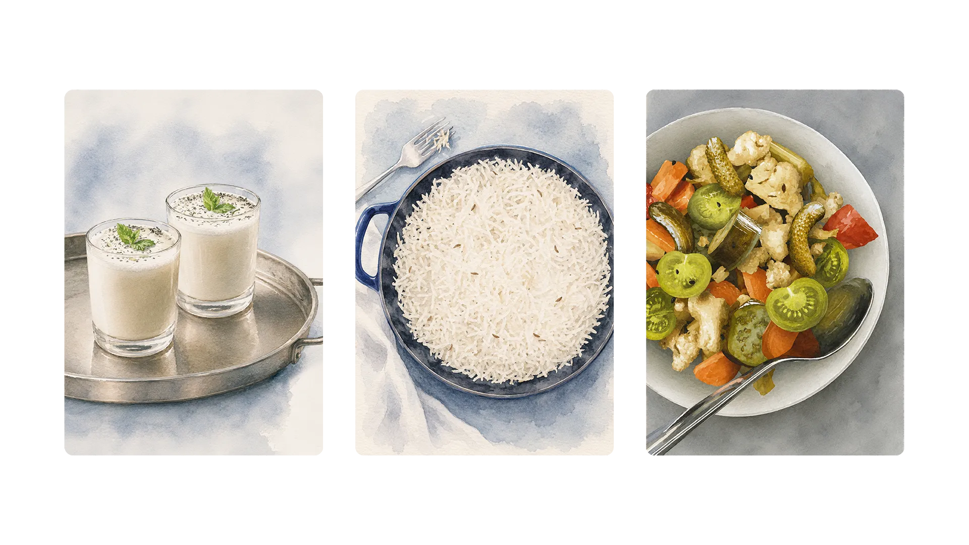
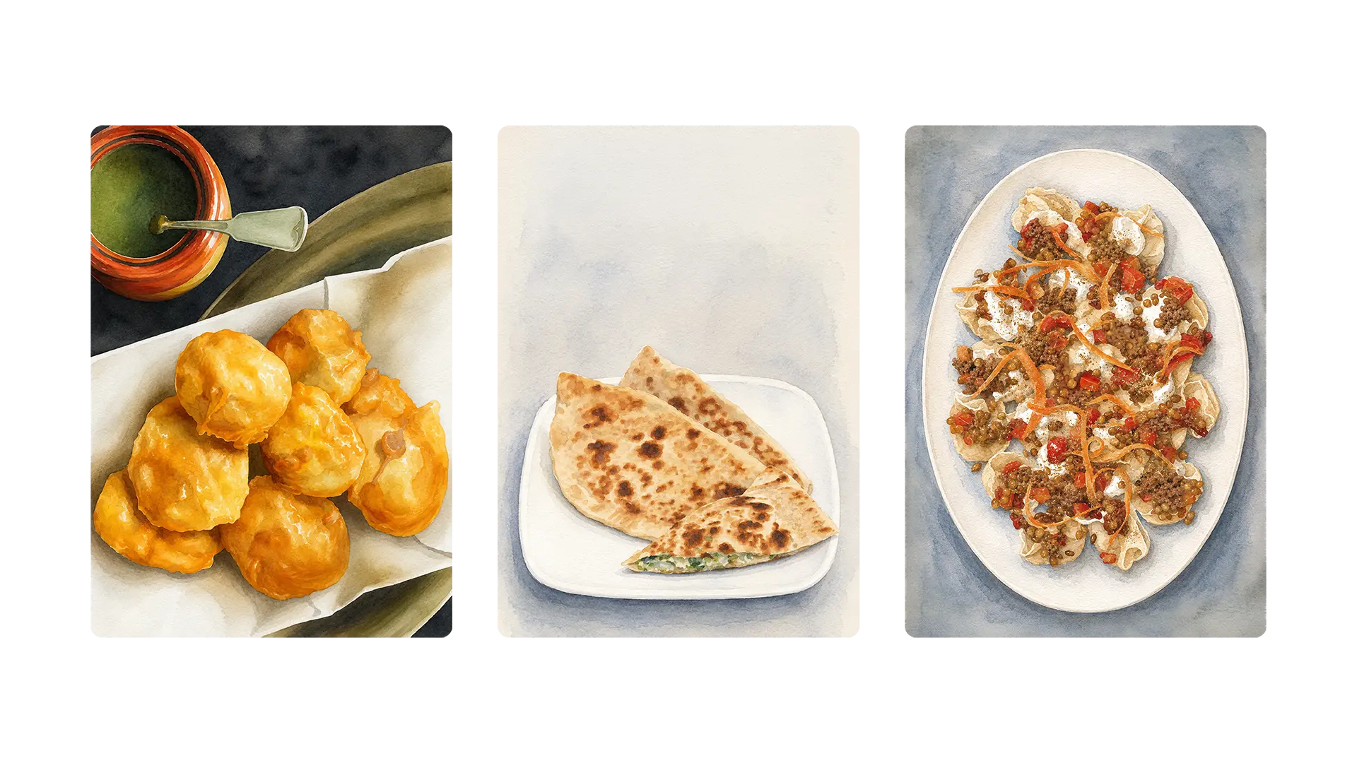
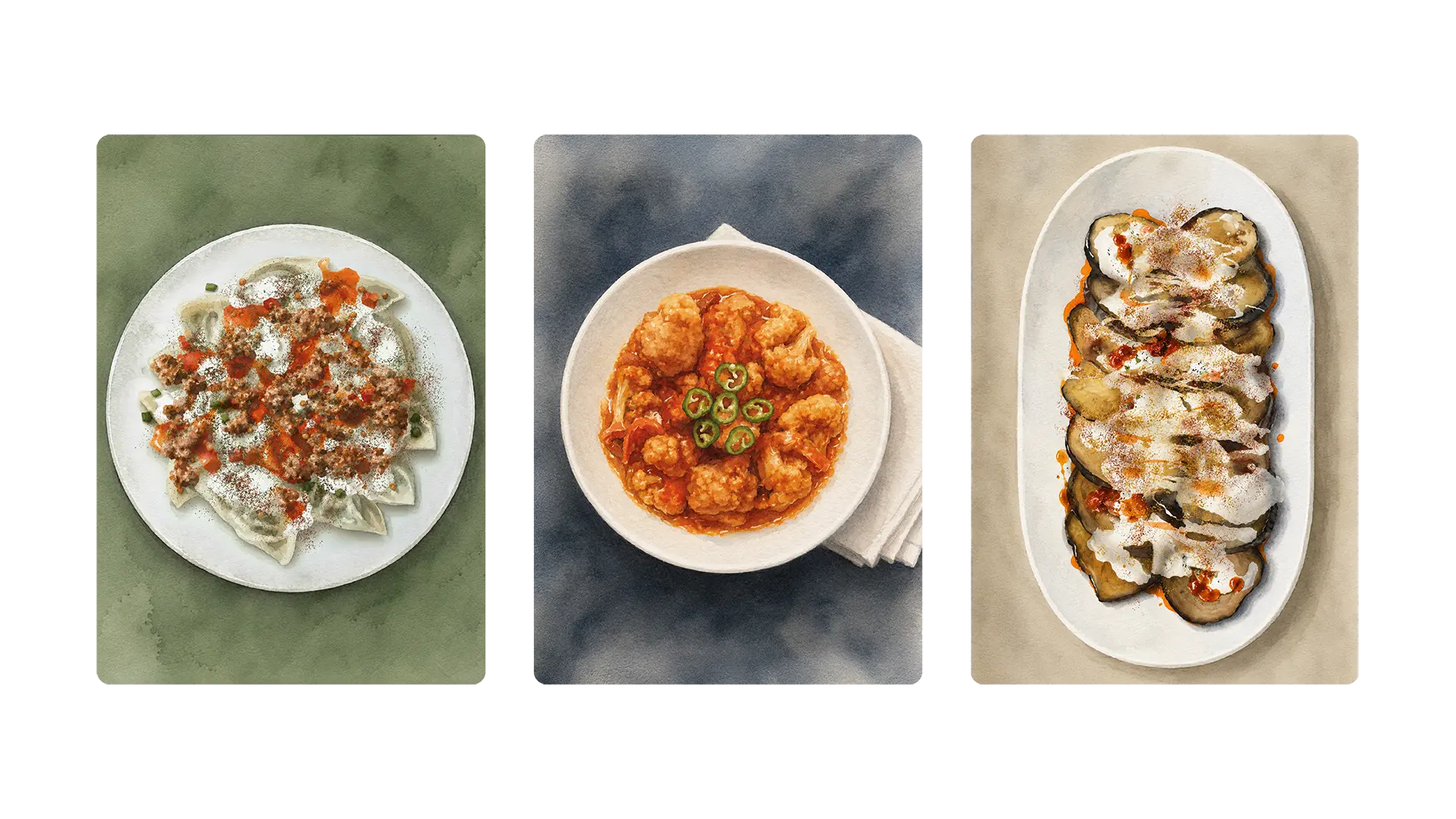
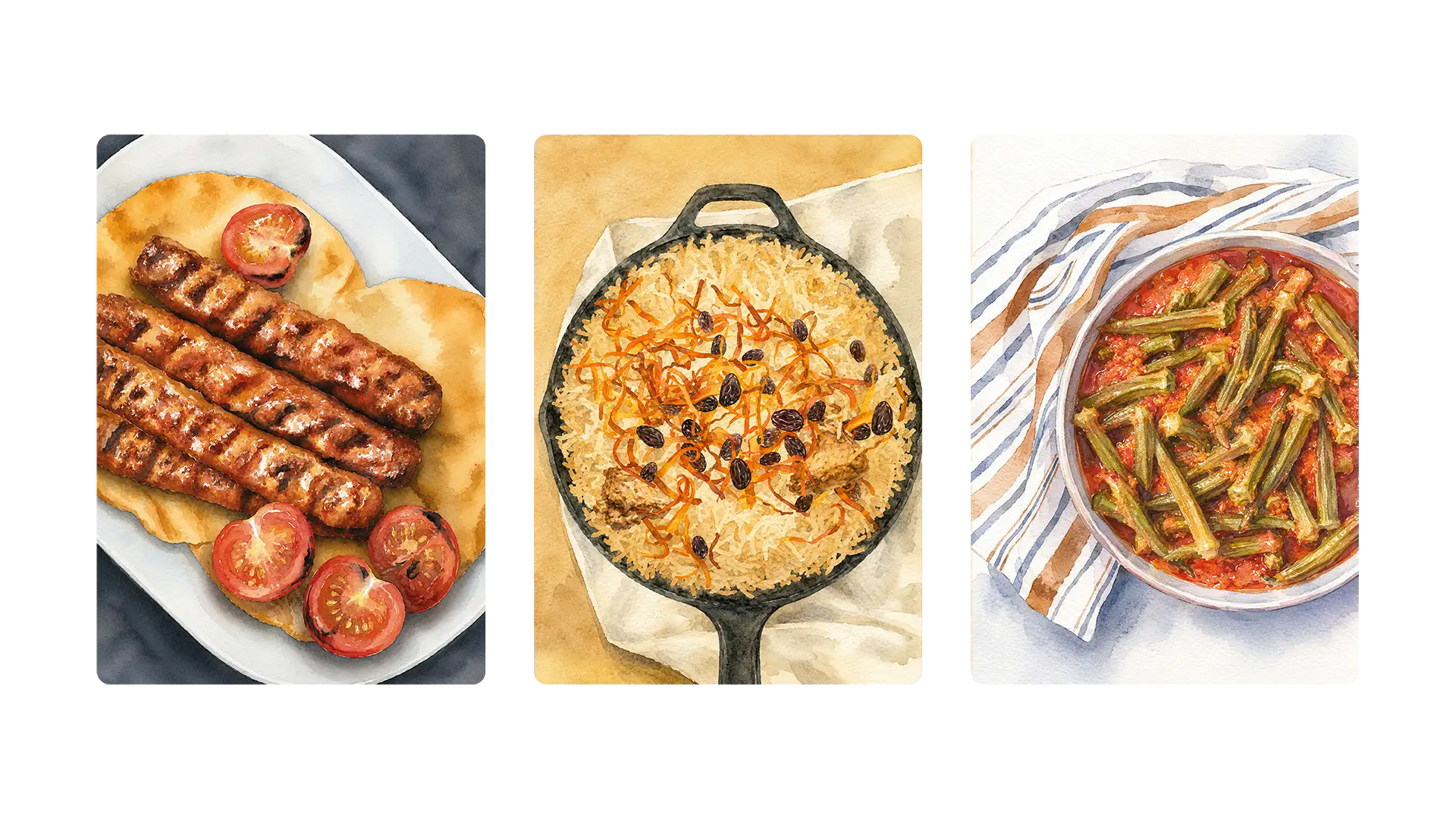
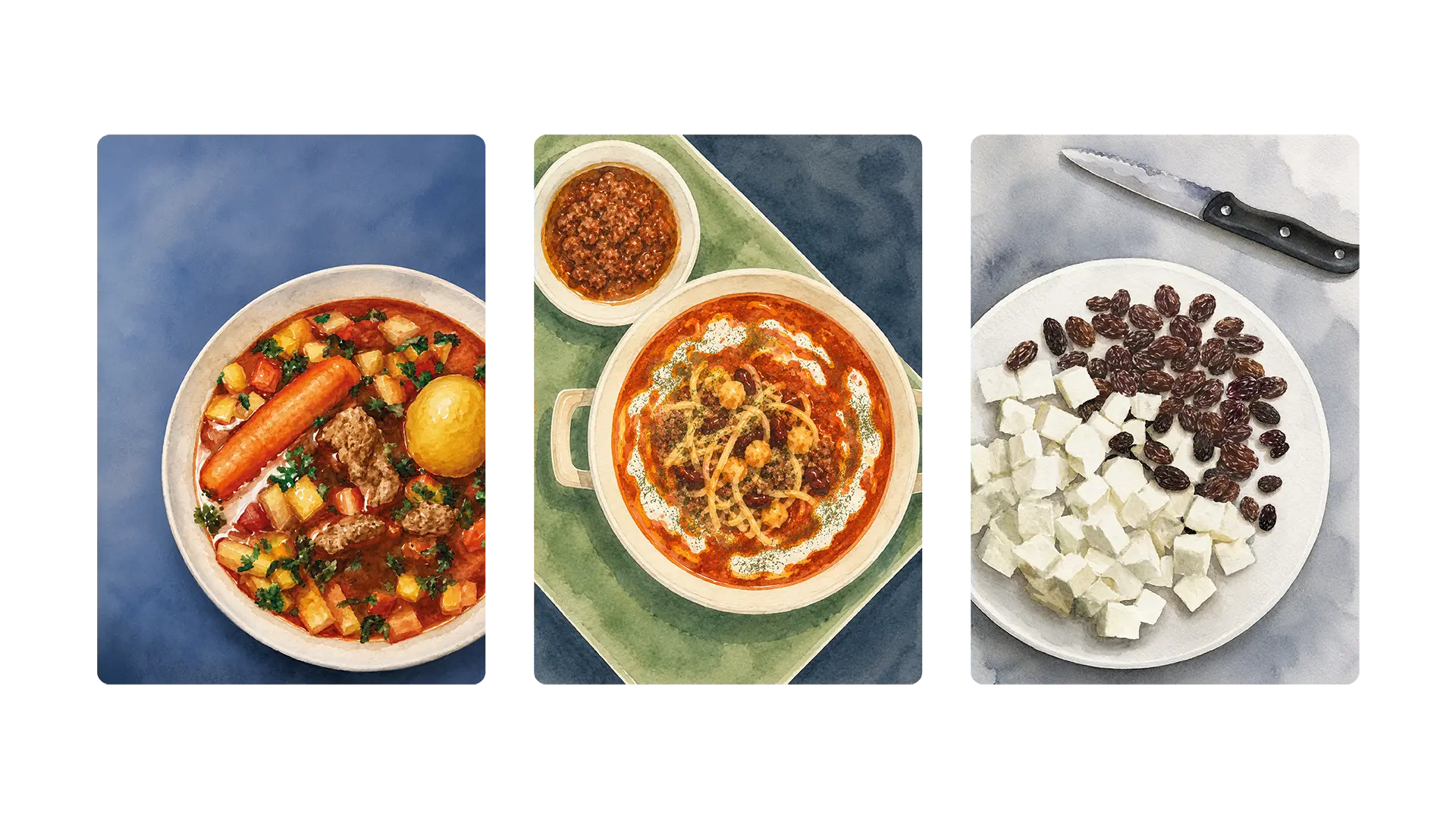
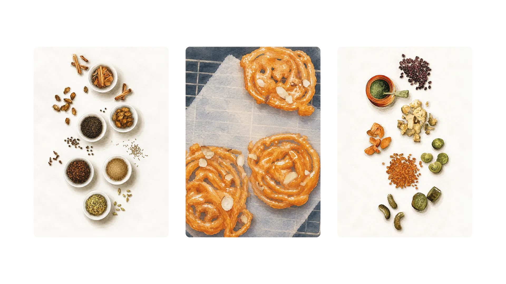
02 Illustration
Image
Challenge
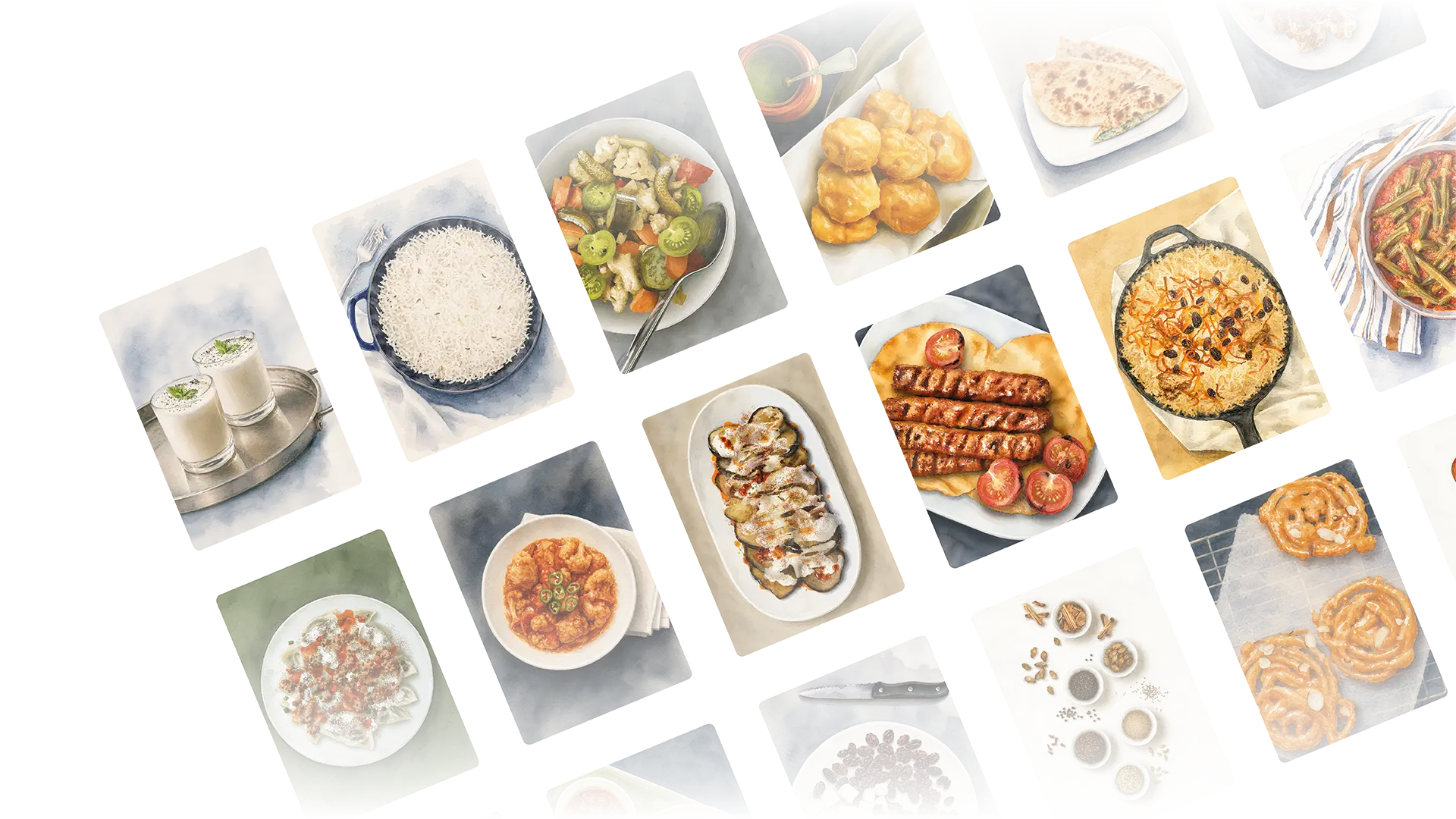
Creating high-quality food visuals without relying on photography, while maintaining authenticity and visual appeal. Each dish needed to be recognisable and appetising without becoming overly stylised or losing its cultural accuracy.
Approach
All dishes were created as digital illustrations based on photographic references, translating real food into a controlled system. This approach allowed for consistent lighting, composition and styling across all visuals, while avoiding the complexity of cooking and photographing every dish in a professional setting. The restrained design creates a visual contrast that gives the illustrations space to stand out, reinforcing their role as a central element throughout the book.
Outputs
Custom digital illustrations for all dishes
Consistent visual system for food representation
Illustration set integrated across the entire book
Result
Choosing illustration as the primary medium to depict the dishes ensured overall consistency. Traditional photography was replaced by a more precise and adaptable method, creating a distinctive identity without sacrificing realism. This approach differentiated the project from conventional cookbook formats.
03 Editorial System
Image
Challenge
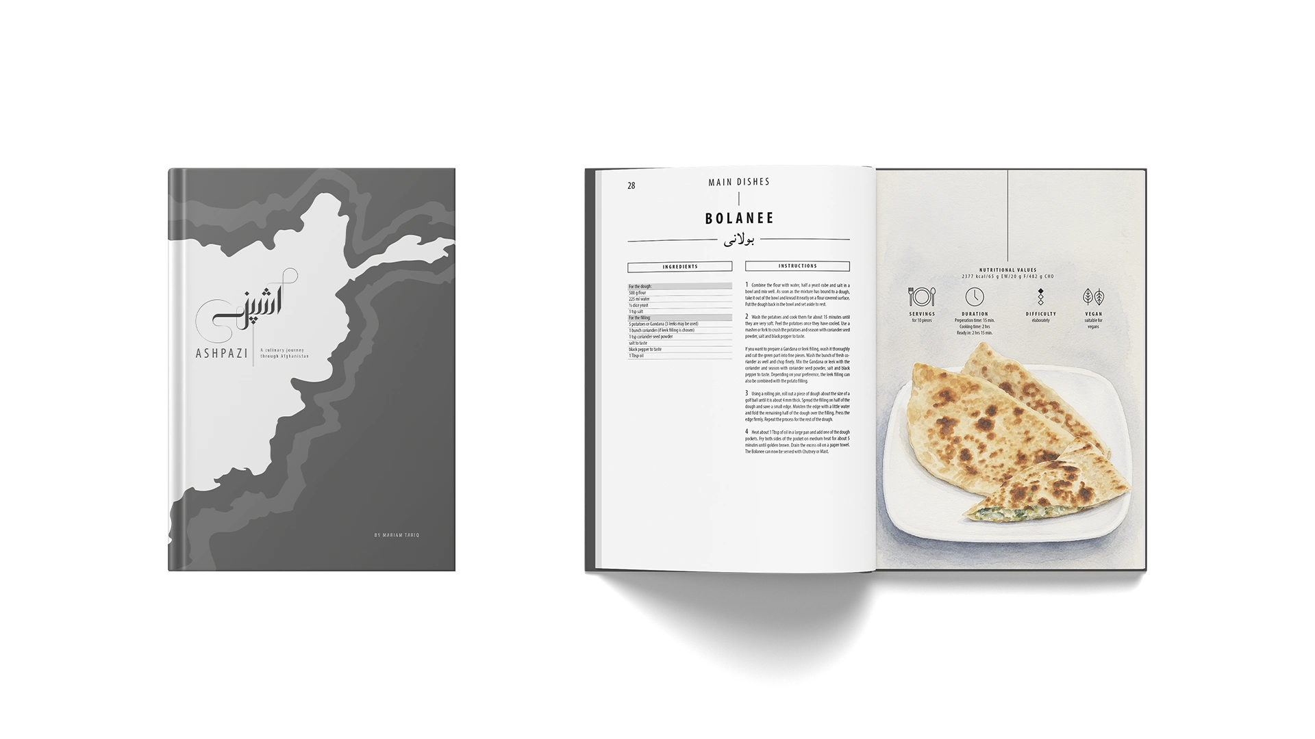
Balancing depth with clarity, while avoiding both overly traditional aesthetics and generic modern minimalism. The layout needed to support content-heavy structures such as recipes, cultural context and informational sections, while remaining accessible and engaging.
Approach
The editorial system was built on a clear and structured layout, using a restrained typographic hierarchy and generous spacing to ensure readability across different topics. Content is organised into distinct sections — including cultural background, ingredients, utensils and recipes — creating a logical narrative flow throughout the book and supporting both exploration and orientation. The design remains intentionally monochromatic, allowing the illustrations to take focus.
Image
Outputs
Complete book layout and editorial system
Structured content architecture across all chapters
Defined typographic hierarchy and grid system
Result
The editorial system establishes a framework that provides both narrative and functional support. By prioritising hierarchy and reducing noise, content remains accessible without relying on decorative elements. This guides readers intuitively through the entire publication, while maintaining a calm and controlled layout.
Image
Impact //
Reflection
This project highlighted the importance of building a system that can support both narrative and functional content. Working without photography required a higher level of control, positioning illustration as a deliberate design decision rather than a stylistic choice. It became clear that the balance between authenticity and contemporary design can be expressed more effectively through restraint and intention than explicit references.
Highlights
Developed a complete editorial system for a full-length publication
Created a consistent illustration system across all dishes
Combined cultural storytelling with modern visual design
Translated personal background into a structured design concept