Spryker — B2B Commerce Platform
Design leadership across web, systems and brand communication.
Overview //
Type
UI/UX Design
Brand System
Campaign Assets
Role
Lead Designer
Scope
Website, Design System, Brand & Campaign Assets, Product Communication
Period
2022 – 2026
Context
Spryker is a modular commerce platform built for enterprise companies operating in complex B2B and B2C environments. Over four years I worked across the company's core digital touchpoints, contributing to the visual and structural systems that connected product, brand and marketing into a single coherent ecosystem.
Goal
The goal was to give a technically complex platform a visual presence as clear and cohesive as the product itself, making it easier for users to navigate the platform and helping them understand the underlying logic of the product through a unified system.
Work //
01 Website
Video
Type
Website Redesign
Migration
Tools
HubSpot, Adobe XD, Google Workspace
Scope
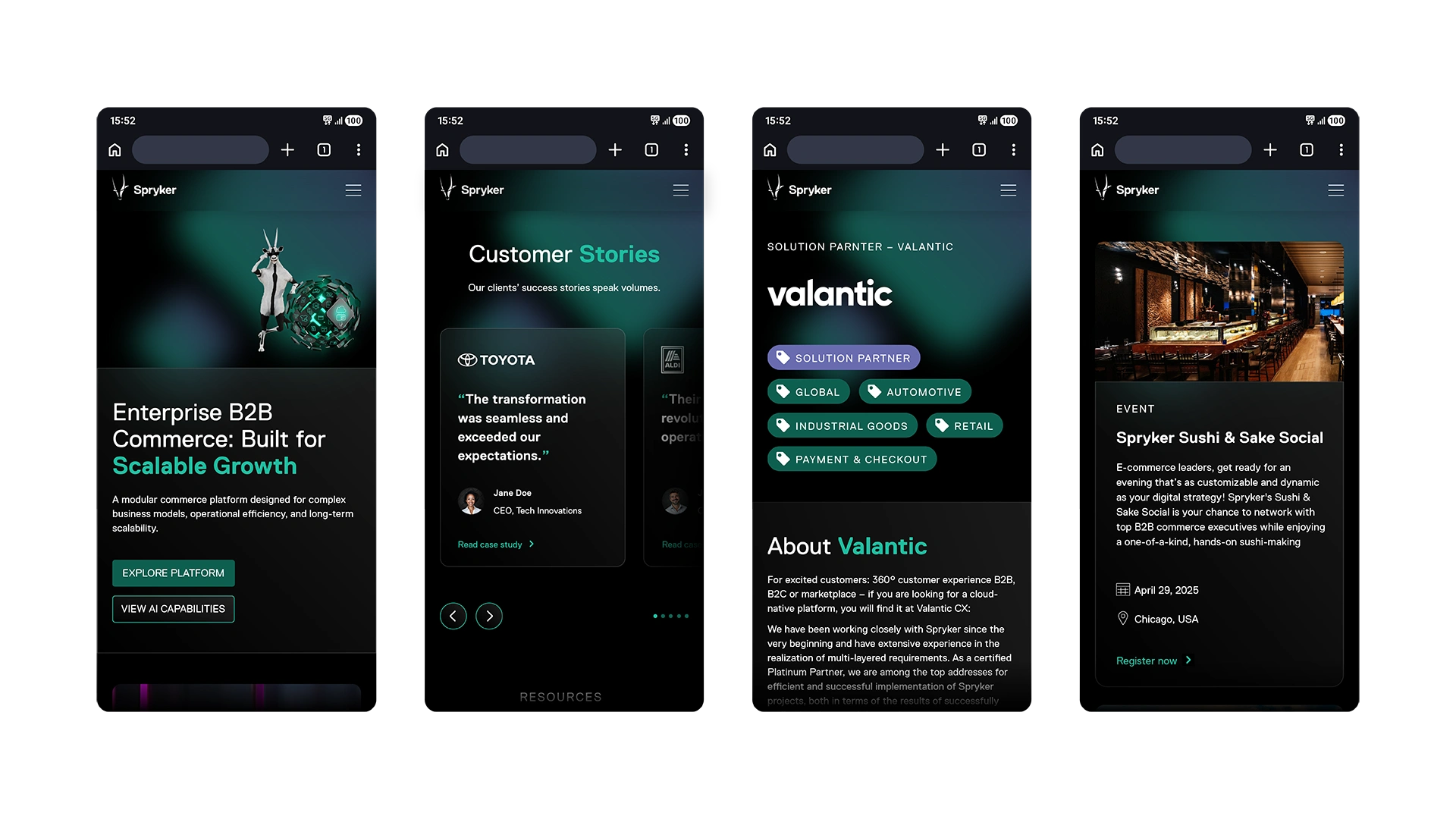
Web, Desktop & Mobile
Collaboration
Design team, Marketing, External Agency
Context
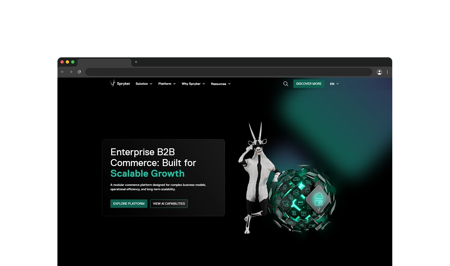
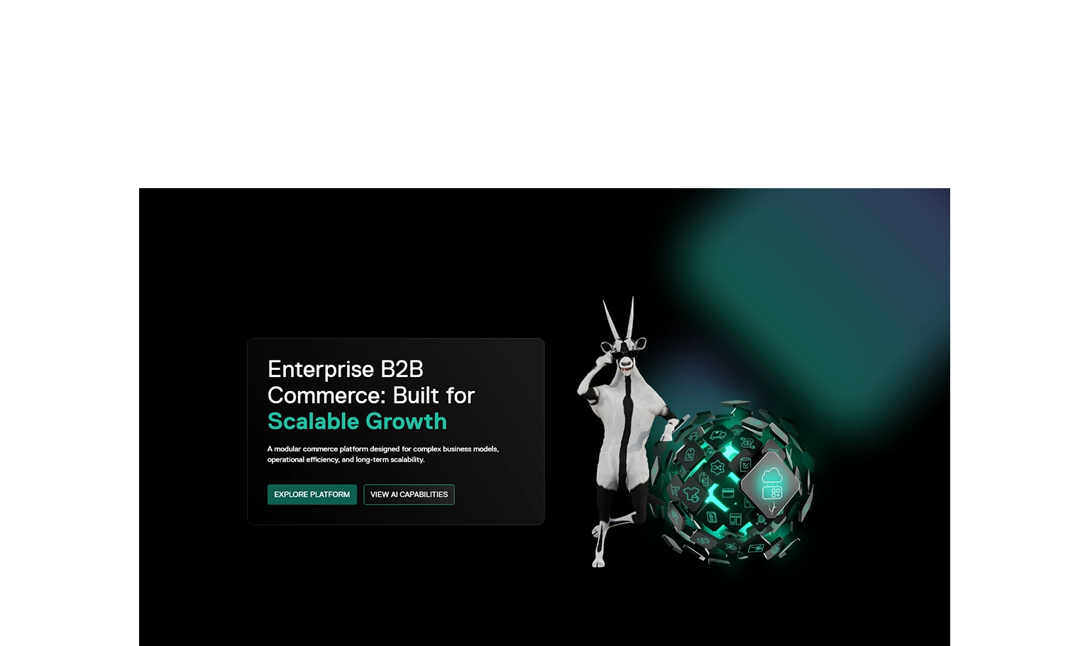
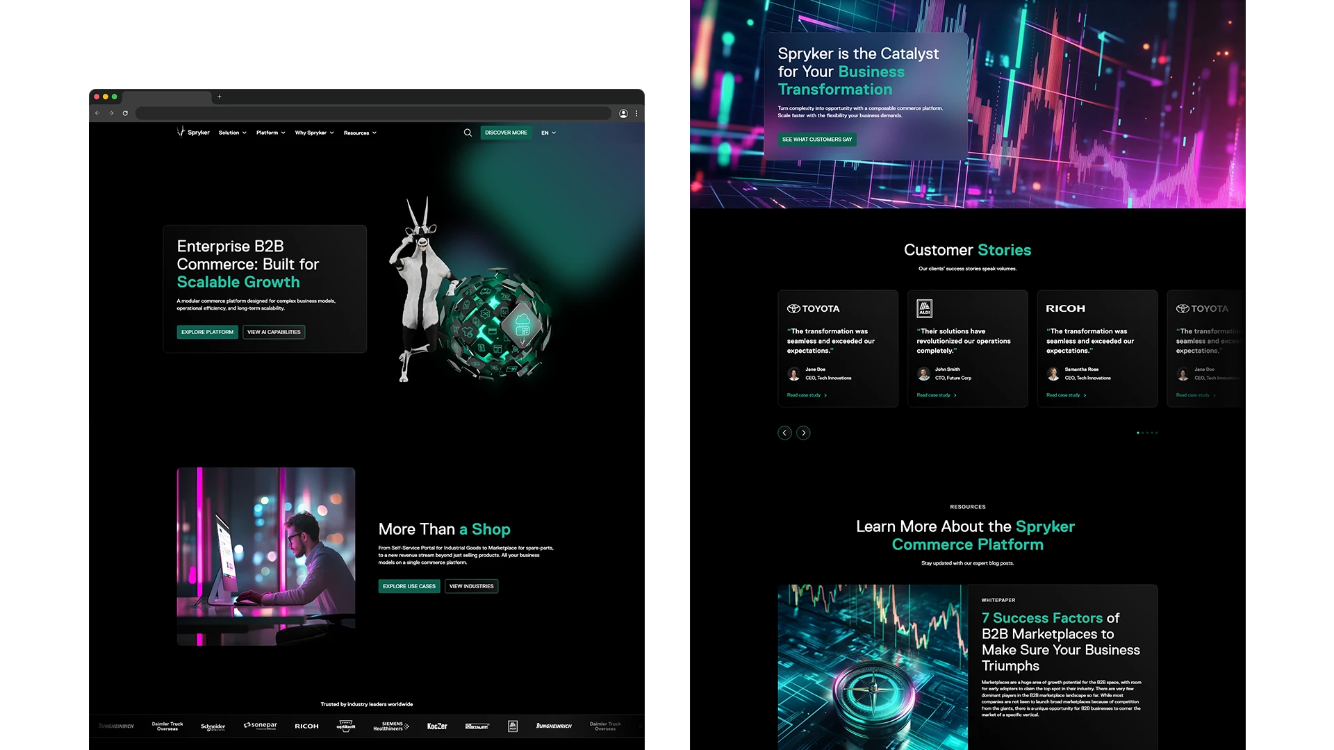
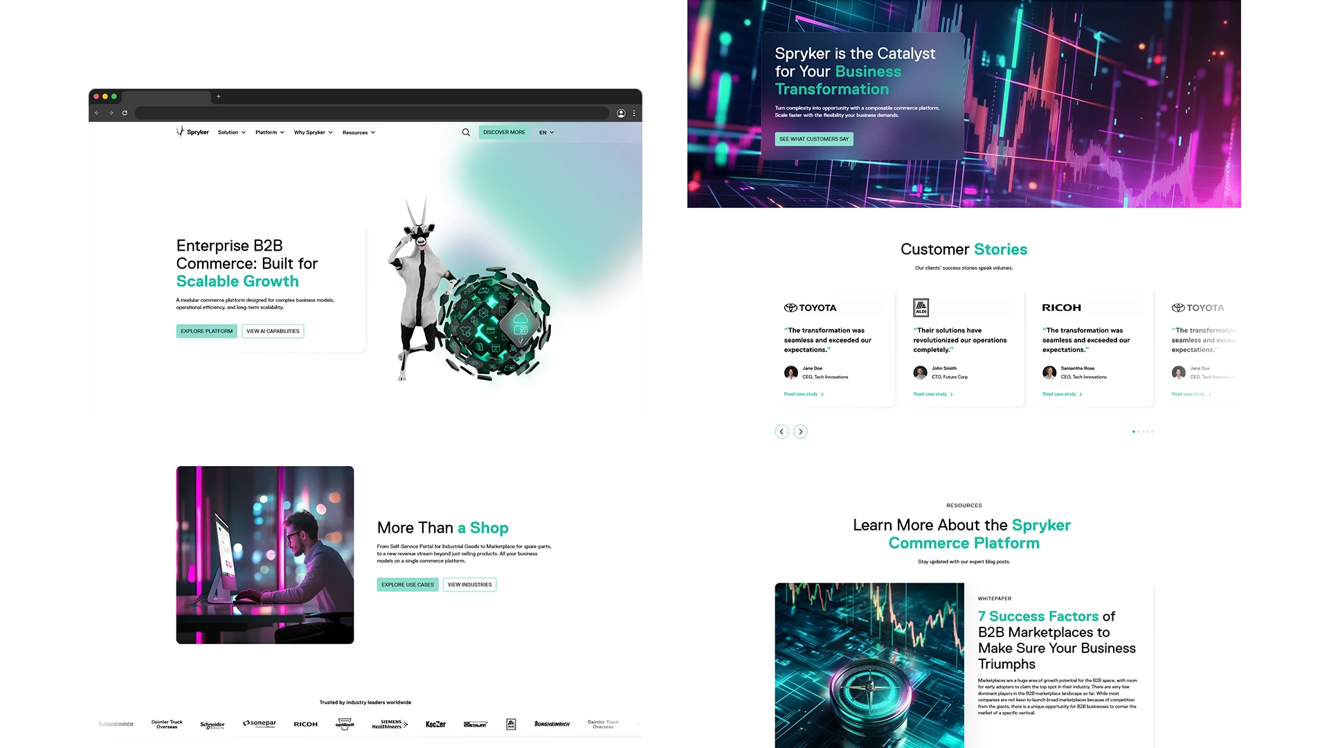
The company website is Spryker's primary platform for communicating product architecture, ecosystem and value proposition to enterprise buyers. When I took ownership of the website design, the existing experience had become visually outdated and structurally complex, no longer reflecting the evolved brand language or the scale the platform had reached.
Challenge
Translating a technically complex, modular enterprise platform into a website experience that is immediately legible, visually compelling and scalable across a large and growing page inventory.


Approach
Before defining the visual direction, I conducted strategic research into market trends and competitor positioning across the composable commerce landscape. These findings directly shaped the concept and supported the case for a more modern, modular approach. Working alongside a specialised HubSpot agency, I took full responsibility for the visual direction, translating structural wireframes into a modular, brand-aligned design system.
Contributions
Strategic market and trend research
Visual direction and design concept
Modular page component design
Dark and Light Mode system
Implementation oversight and quality assurance
Image
Image
Outputs
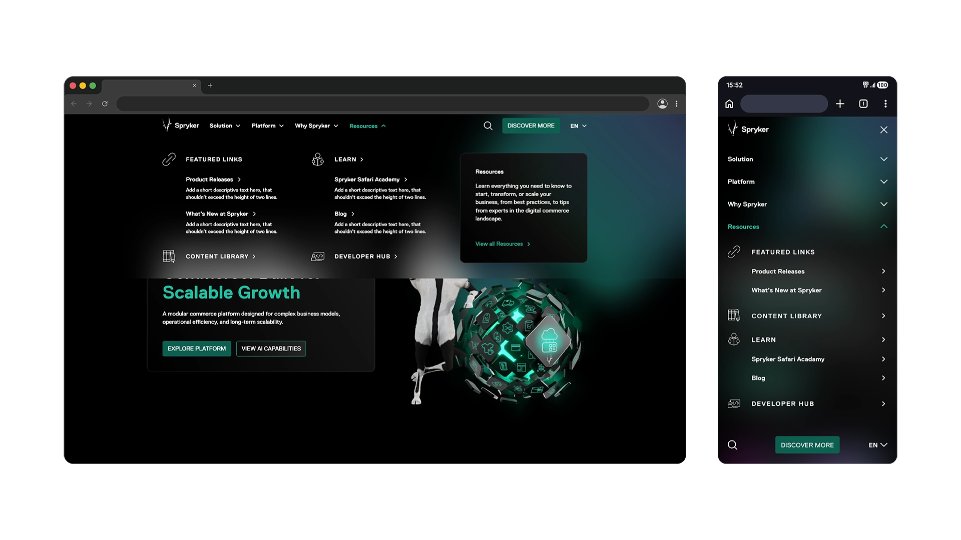
16 high-fidelity page mockups across desktop and mobile
100+ HubSpot pages built and structured
Complete visual asset library across all page types
Bug reporting and optimisation documentation
Result
A fully redesigned website experience aligned with Spryker's evolving brand language and built on a modular component system capable of scaling with the platform.The new visual direction improved clarity of product communication and established a consistent foundation across the entire page inventory.
02 Design System
Type
Brand System
Design Guidelines
Tools
Adobe CC, Google Workspace
Scope
Web, Print, Digital, Events
Collaboration
Design team, Brand lead
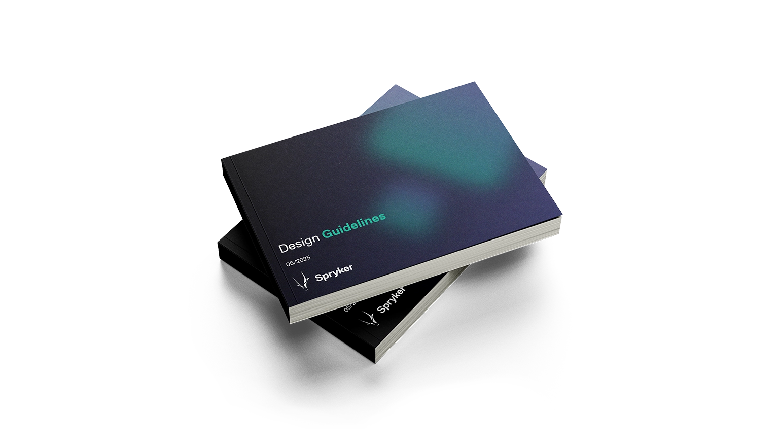
Context
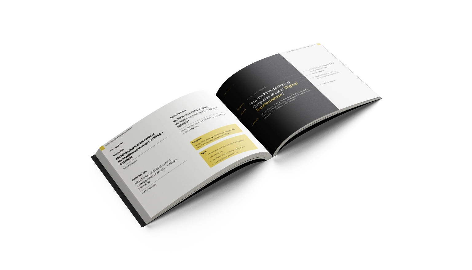
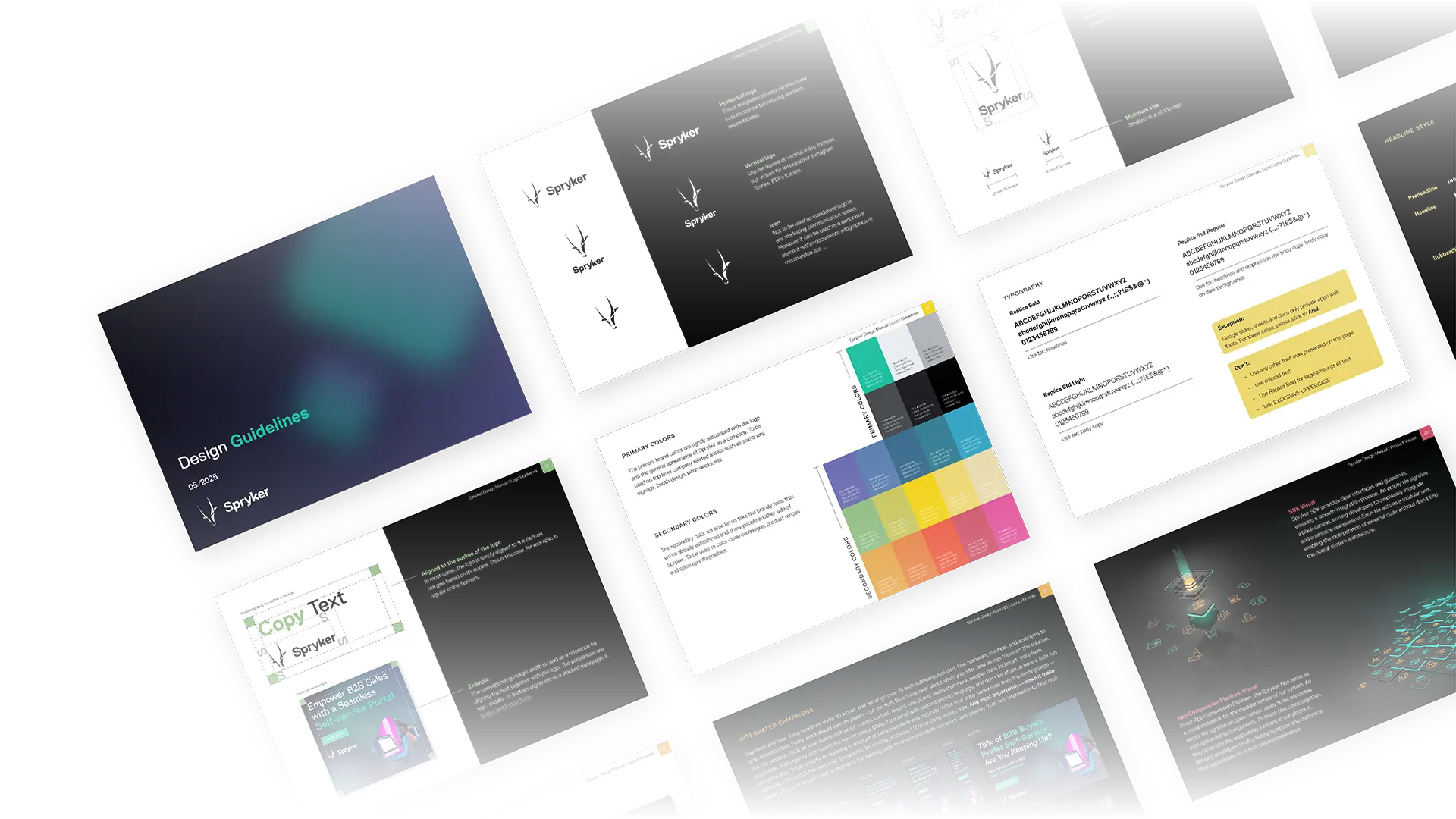
Spryker's brand needed a single source of truth — a system capable of serving as the foundation across every format, enable teams to produce independently where needed, and keep the visual language consistent and scalable across an expanding set of channels and collaborators.
Challenge
As the range of formats and channels in production grew, the absence of a shared system became increasingly visible. Design decisions lacked a consistent foundation, and producing on-brand content at scale required more structure than existed.
Image
Approach
Building on Spryker's existing tile metaphor, rooted in the concept of composability, I developed a structured visual system spanning layouts, design elements and campaign logic. I defined rules for every major format category and developed a library of templates and reusable patterns to streamline production and enable independent work where needed. Beyond visual rules, I documented how the system operates in practice across relevant contexts and use cases.
Contributions
Visual language development: tile-based layouts, colour, typography and design elements
Logo, mascot and photography guidelines
Banner system and newsletter templates
Icon system and integrated campaign logic
Outputs
Complete brand guidelines document (78 pages)
Online banner templates (Photoshop and InDesign)
HubSpot newsletter templates across 5 content types
Adobe Cloud Library and Google Drive icon set
Result
A complete brand system that gave every contributor a single reference for producing on-brand content independently. Templatized workflows reduced the overhead of recurring production tasks, while a shared visual language scaled consistently across formats from digital to print to physical space.
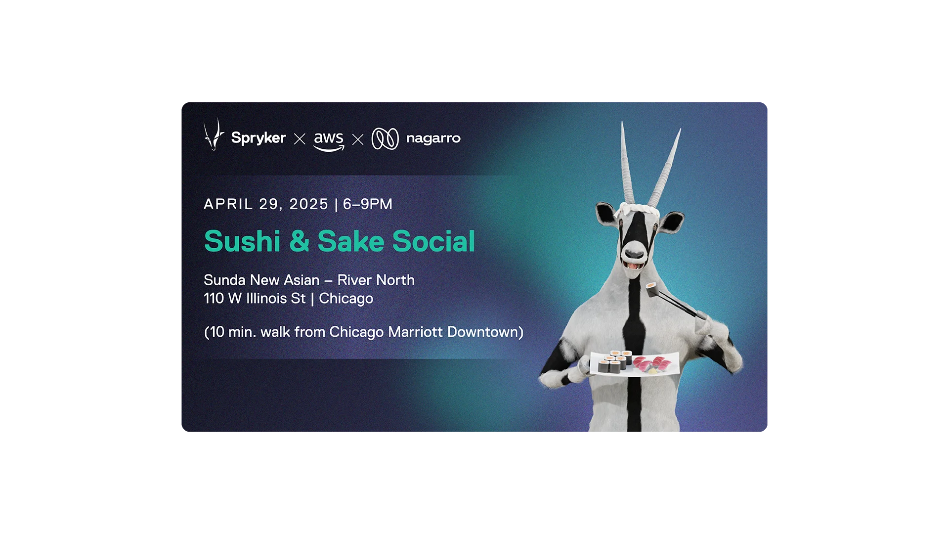
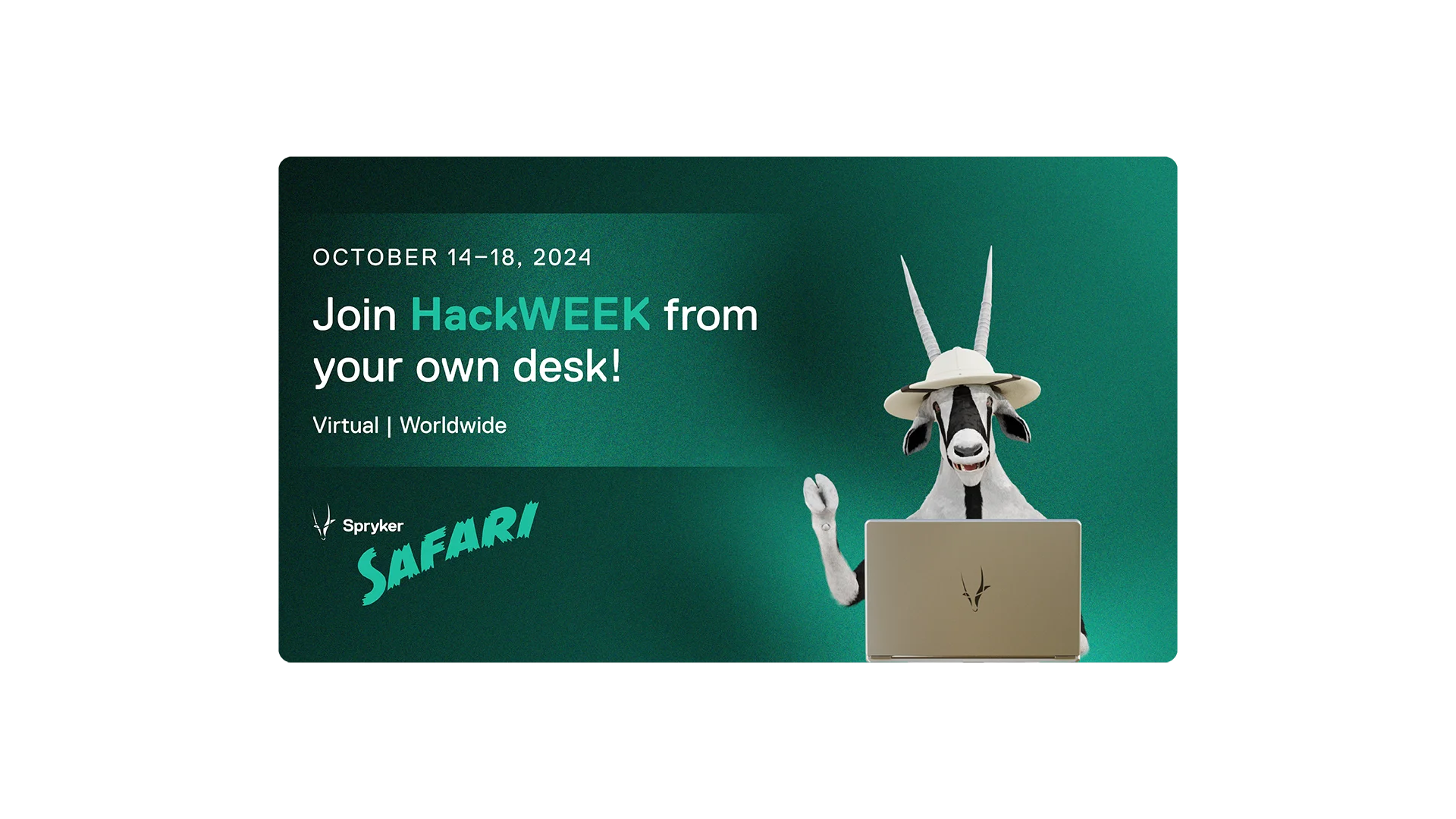
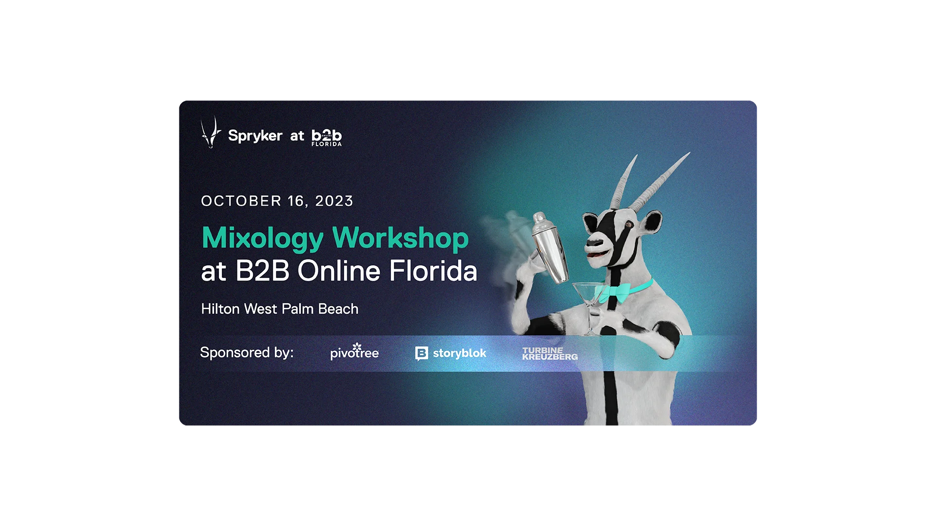
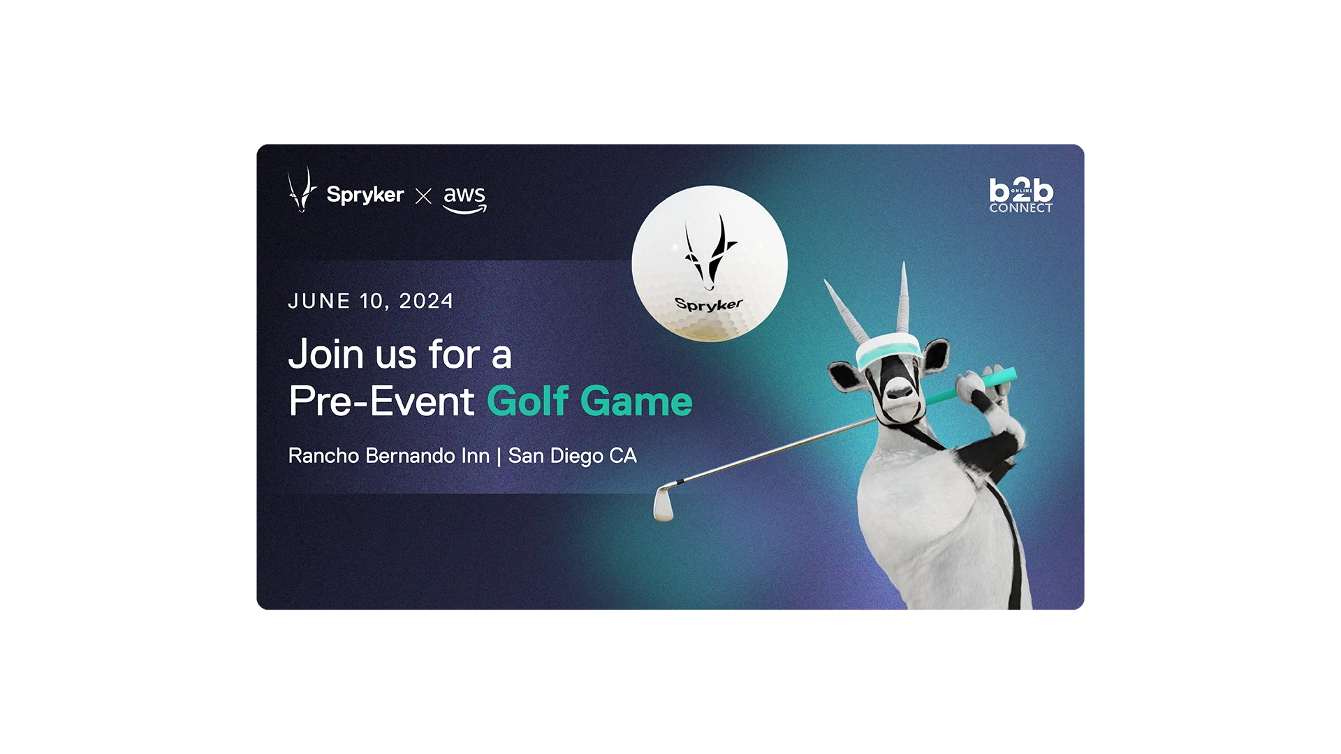
03 Brand & Campaign Assets
Image
Type
Brand & Campaign Assets
Tools
HubSpot, Adobe CC
Scope
Digital, Print, Events
Collaboration
DevOps lead, Brand lead
Context
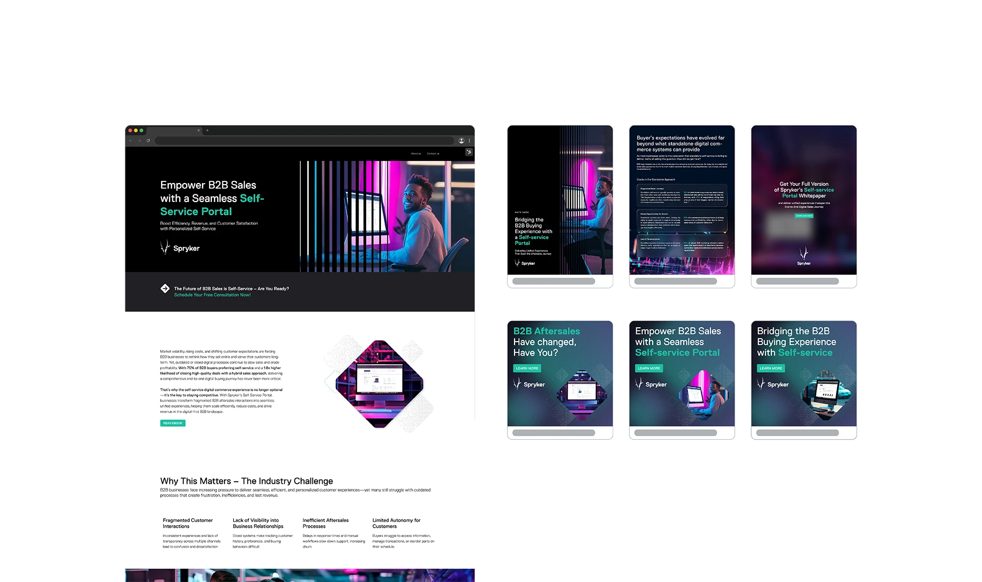
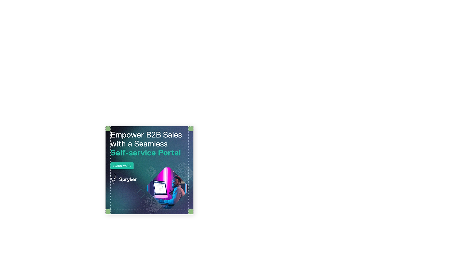
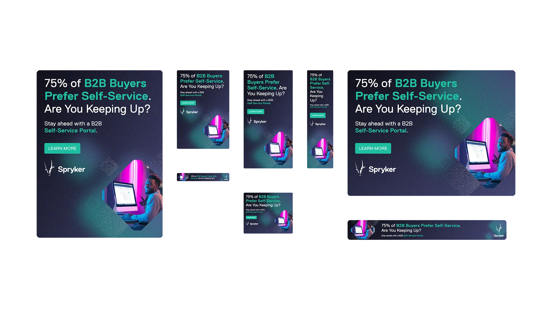
A brand system only proves its value when applied consistently across every touchpoint. For enterprise buyers, visual coherence is not merely aesthetic — it signals reliability, professionalism and trust in the product behind it. Whitepapers, campaign banners and event materials each serve different purposes, but together they form the visible surface of the brand in the market.
Challenge
Maintaining the visual consistency that makes a brand recognisable and trustworthy across formats that each follow their own logic and serve fundamentally different contexts and audiences.

Approach
Every format was approached with the same underlying logic: the visual system as a constant, the format as a variable. Rather than adapting the brand to fit each medium, I translated the brand's core language into the specific requirements of each format while preserving what makes it recognisable.
Contributions
Self-directed learning of HubSpot and its module system
Collaboration with DevOps lead on digital content module development
Visual direction and layout across all asset formats
Proactive ownership of ongoing template maintenance and visual system refinement based on company requirements
Image
Outputs
Whitepapers across multiple campaign topics
HubSpot landing pages and content modules
Online banners across multiple formats and campaign series
Event booth and rollup designs
Result
A consistent brand presence across every communication format the platform operated in. Each asset reinforced the same visual language, building the kind of recognisability and trust that a brand operating at enterprise scale depends on. By taking ownership of template maintenance and continuously refining the system based on real production needs, the asset library grew into a reliable, self-sustaining foundation for the entire marketing operation.
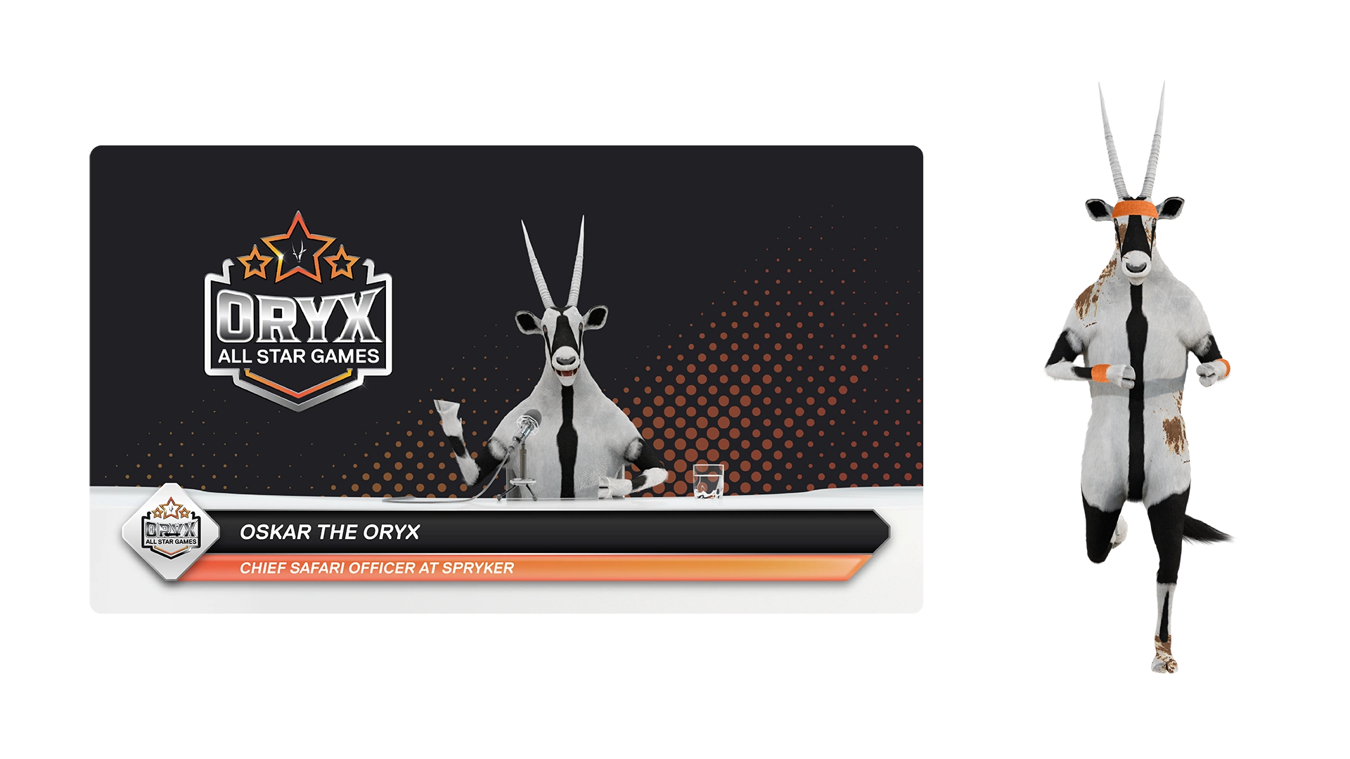
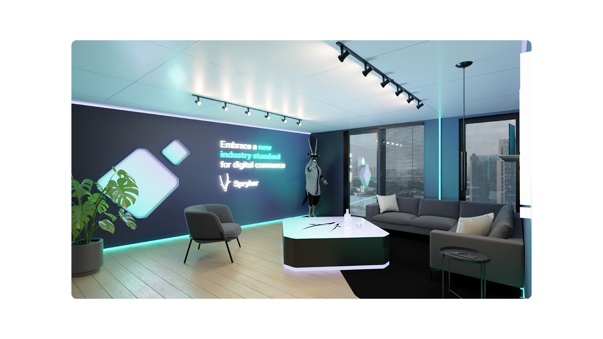
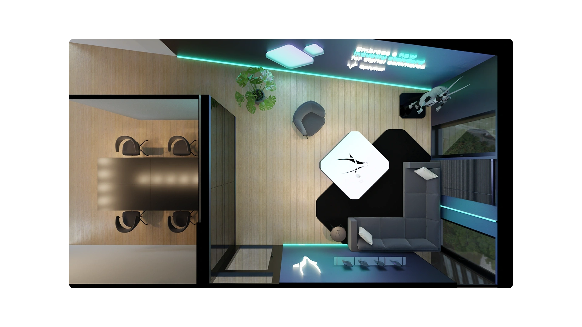
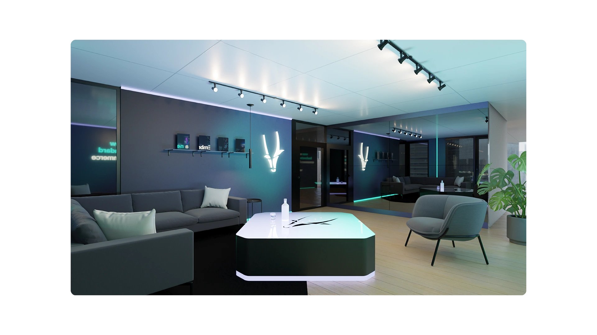
04 Product Visual Communication
Image
Type
Product Visual Communication
Spatial Design
Tools
Adobe CC, Blender
Scope
Digital, Print, Physical Space
Collaboration
Video producer
Context
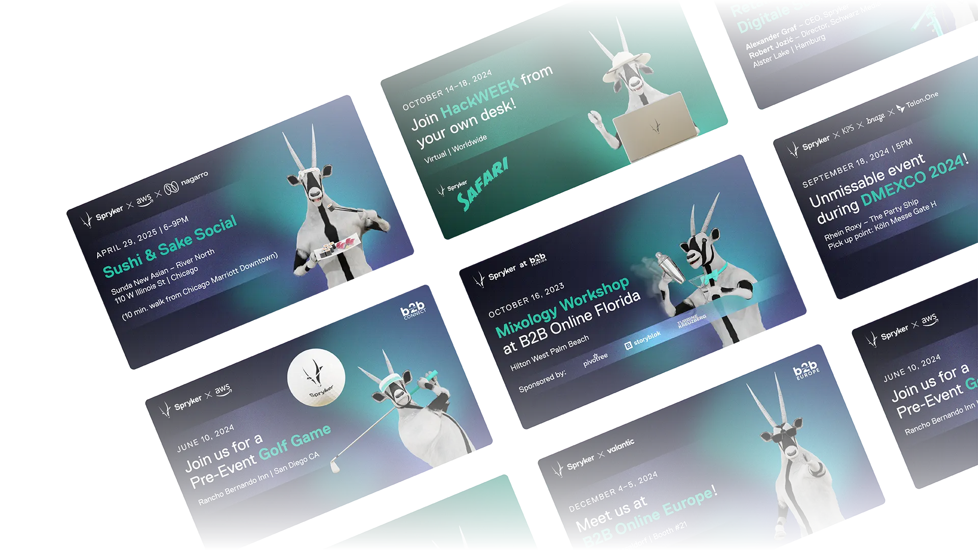
Communicating a technically complex, modular platform requires more than documentation or interface screenshots. Visual storytelling through three-dimensional scenes, spatial concepts and brand characters can make abstract product concepts tangible and memorable in ways that text alone cannot achieve.
Challenge
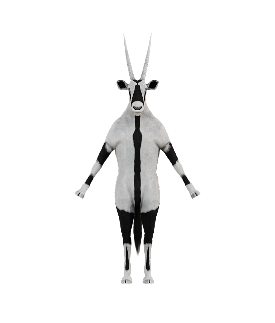
Spryker's mascot had evolved significantly over time, from a photographic collage to a professionally modelled 3D character. Taking ownership of the character's placement and scene direction meant learning to work with the Blender file directly, creating scenes that felt true to the brand's visual language and communication goals. Extending this into spatial design added another layer of complexity, where physical constraints and three-dimensional space required a different kind of thinking than screen-based design.

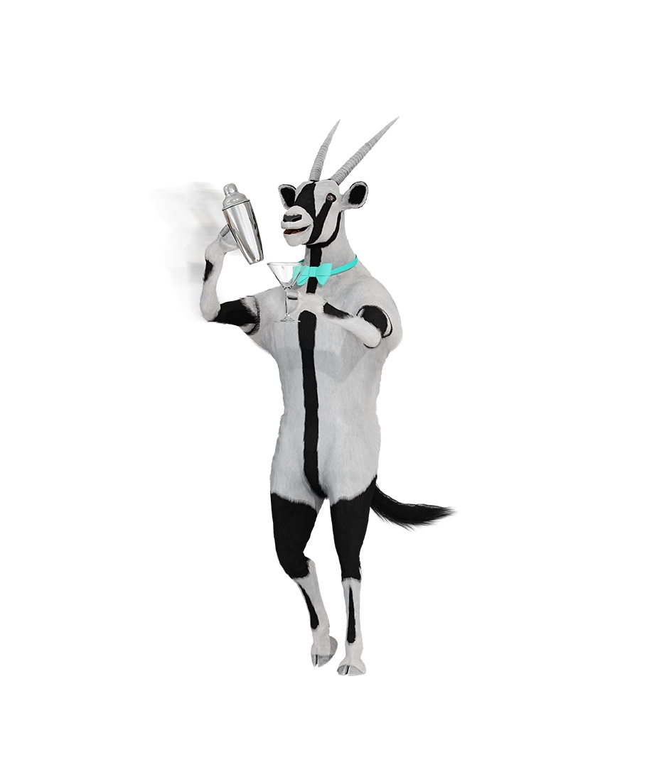
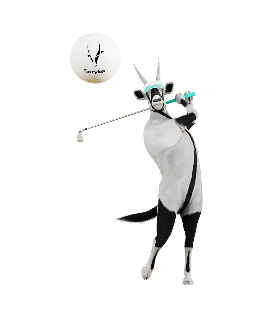

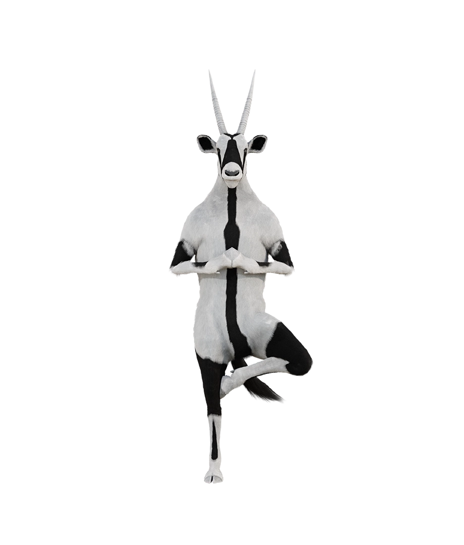
Approach
Working directly with the mascot's 3D model, I developed scenes that translated the brand's visual language into three-dimensional space. Each scene was built around a specific communication goal, whether supporting a campaign, enriching a website section or extending the brand into a physical environment. For the EBC office concept, I designed a spatial environment that carried Spryker's visual identity from screen to room, working within the possibilities and constraints of physical space to create something that felt as considered as any digital touchpoint.
Contributions
Self-directed learning of Blender to work with the mascot's 3D model
Scene direction and visual placement of the mascot across communication contexts
3D asset production for website, campaigns and print
Development of static scenes and visuals as a foundation for animated content in collaboration with the video producer
Image
Outputs
3D mascot scenes across campaign, website and print contexts
Static visuals for animated content including All Hands screens
Banner and asset visuals incorporating 3D elements
Spatial design concept for the EBC office environment
Result
Expanding the brand's toolkit to include 3D production gave Spryker a new expressive range, one that could translate the platform's identity into scenes, spaces and stories that static design alone could not deliver. The EBC office concept extended this thinking into physical space, demonstrating that the brand's visual language was robust enough to hold across every dimension it was asked to inhabit.
Impact //
Result
Four years of design ownership across a growing platform resulted in something more durable than individual deliverables alone: a visual foundation that scaled. Structured systems, consistent principles and a coherent language across every touchpoint gave the team a stable base to build on. The work spanned strategy, concept, production and quality oversight, demonstrating not only design execution but the ability to lead design thinking across an entire digital ecosystem.
Reflection
Spryker shaped my understanding of design at scale. The most consequential work was rarely the most visible: it was the decisions about structure, consistency and system logic that determined how well everything else held together. Working across website, brand and product communication simultaneously reinforced that good design leadership is less about controlling output and more about building the conditions in which quality can be sustained.
Highlights
Progressed into a lead role with full design ownership across an international enterprise platform.
Learned to think beyond individual assets toward systems, ecosystems and long-term visual foundations
Discovered that systematic thinking and attention to detail are not just personal traits but a quality standard others can rely on
Gained perspective on design from multiple disciplines, strengthening both strategic thinking and cross-functional collaboration
Expanded my own capabilities through self-directed learning, bringing new tools and formats into the team's repertoire